Email Design Inspiration: 7 Resources to Bookmark in 2026
Two days before a welcome series is due, the file holds four empty artboards and a brand PDF that says "premium but warm". The instinct is to open a gallery, screenshot six layouts you like, and rearrange boxes until something looks finished. That path produces an email that looks like last year and behaves worse.
Memory is the weak link. You remember the campaigns that impressed you, not the ones that performed, and you remember them as pictures rather than decisions: where the hero sat, how much copy ran above the first call to action, whether the footer did any work.
Studying real sends fixes that, because you can see the choices under pressure. You see the hierarchy the designer kept when the headline ran two lines long, the fallback when images were blocked, the module count a weekly newsletter needs to survive production.
The audience is broader than most moodboards assume. The Ofcom Online Nation 2022 report found that 51% of UK online adults used email services on an average day, and Microsoft services reached 65% of online users aged 15 to 24 while Gmail led among people aged 25 and over. Two inbox ecosystems, two generations, one layout.
The seven resources below are research tools for that kind of reading, each with a different method for pulling layout, hierarchy and structural decisions out of a real send.
Table of Contents
1. Campaigns by Steeve Elgui
Open this section when you need to see one identity stretched across email, social and display without losing its footing. It's a campaign portfolio rather than an inspiration gallery, and that's why it earns the top slot.
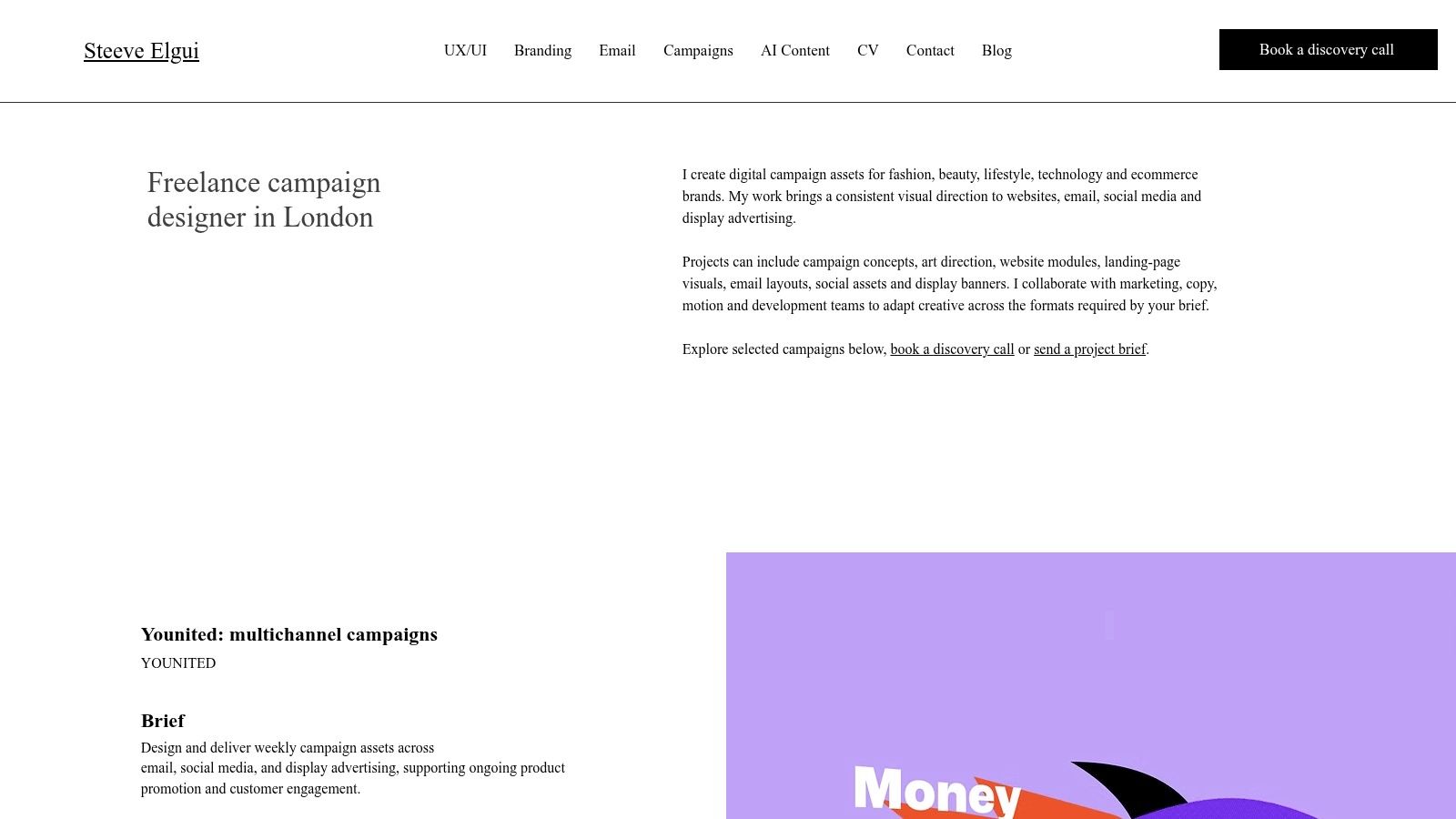
The Younited work is the part to study. Email templates sit alongside the related campaign assets built from the same visual language, so you can trace individual decisions across formats: type scale, image crops, colour roles, button treatment. A gallery of screenshots rarely shows that continuity. Here it's the point of the page.
What the cross-format set actually shows
A designer looking at emails in isolation can't tell whether the brand's heavy headline weight is an email convention or a brand rule. When the same weight appears in a social tile at a fraction of the canvas, you know it's a rule. Apply that test to your own template: pick one decision, find it in three formats, and check whether your email would hold it.
Worth copying: three or four visual decisions repeated across every asset. A send that reinvents its type treatment is an indulgence, not a system.
The weekly production problem
Recurring campaign output is a different skill from a one-off launch, and this portfolio leans on that. The operational benchmark for it is modularity. Co-op consolidated five separate email implementations into one design system and cut its module library from 46 to roughly 20 without losing capability, supporting 1,400 campaigns in 2024 against 800 unique creatives in 2022 (Co-op email design system case study). Fewer, better-documented modules beat a library that's hard to use.
The layout thinking underneath that is the same discipline covered in the UX and UI portfolio: grids, spacing scales and components that survive content changing at the last minute.
Pros
Cross-format evidence: email shown next to social and display assets from the same campaign.
Consistency under repetition: the Younited examples hold the identity together across formats.
Recurring delivery: shows capacity for weekly campaign design rather than one-off pieces.
Wider practice: CRM, branding and digital design sit in one portfolio.
Cons
No commercial detail: the page is a showcase, so it doesn't explain pricing, timelines or working arrangements.
No performance data: it doesn't give results or detailed campaign strategy.
2. Really Good Emails
Galleries usually sort by aesthetic. This one sorts by job, which is the difference between browsing and research.
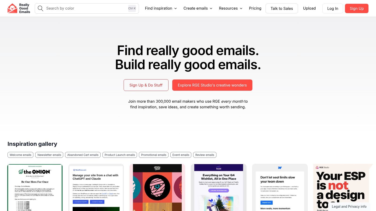
The filters match real briefs: welcome sequences, product launches, newsletters, promotions. Examples span retail, SaaS and editorial work, and you can save the ones relevant to a live project. The gallery browses without touching RGE Studio, the separate production product the site also sells.
Use it as a teardown library rather than a mood board. Pick a send that matches your next campaign type, then work backwards through the layout: what the designer wants you to see first, where the first real decision sits, and how many distinct blocks carry the structure.
Judge every example at phone width
The DMA email benchmark work recorded that almost 80% of consumers use mobile devices to engage with marketing emails, so open each reference at 375 pixels before you look at the desktop version (GDMA email benchmark summary). What survives the narrow screen is structure. What disappears was decoration.
On each saved example, check three things:
The first thing you see: squint until the text blurs and confirm the dominant element is the one the brief cares about.
The distance to the first CTA: count the blocks between the top of the email and the button.
The module count: how many distinct units the designer used, and whether the send still works with two fewer.
That last check matters most in production. Fewer modules mean less bespoke HTML to maintain across recurring sends, and the same discipline runs through the UX/UI design portfolio, where grids and components are specified as systems rather than one-off screens.
Pros
Useful taxonomy: filters match real briefs rather than vague moods.
Range: styles and campaign types spanning retail, SaaS and editorial.
No account wall: the gallery browses without an email-building tool.
Cons
Curated, not complete: you see a selection, not a brand's full sending history.
No performance data: examples show what was sent, not how it performed.
Product prompts: expect nudges towards the separate RGE Studio product.
3. Email Love
One polished send tells you very little. This library is worth bookmarking because it shows campaigns in sequence, which is where design decisions start to make sense.
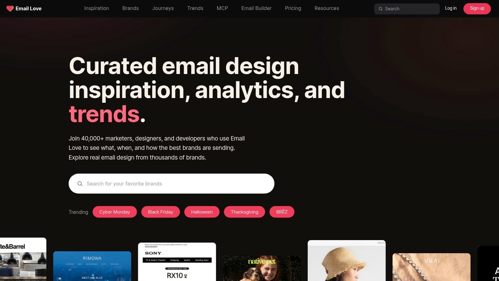
Browse real emails by industry, type and style, then follow lifecycle journeys and brand-level activity: onboarding, cart abandonment, re-engagement. Trends and reports sit behind a free account, and a separate Figma plugin turns designs into email HTML when you're ready to build.
Journeys expose the decisions a single send hides
Take an abandoned-cart sequence and compare its three emails. The first usually carries the product and the price, the second changes the frame, and the third has to earn attention without repeating itself. That's hierarchy doing commercial work rather than decoration.
The channel split matters here. In the 2025 UK SMS and email marketing report, 55% of surveyed consumers preferred email for brand news and 56% for product previews, while 84% wanted to customise the types of message they receive by channel and 70% believed email and SMS should serve distinct roles. Design each step to do something the other channel can't.
The preference centre behind those choices is a legal surface as much as a layout one. Under PECR, consent for unsolicited marketing email must be specific, informed and given by a clear affirmative action, pre-ticked boxes don't count, and the sender must identify itself and provide a valid contact address (ICO guidance on marketing and data protection).
Pros
Journey view: shows how a campaign sits inside a wider customer sequence.
Dual purpose: useful for design research and for CRM planning.
Free to browse: the gallery and insight pages don't need a paid plan.
Cons
Account needed for some reports: research features sit behind a free sign-up.
Separate production tool: the Figma plugin is kit, not part of the inspiration library.
4. Milled
If you need to know what a named retailer sent last November, this archive answers the question instead of suggesting a mood.
Search by brand, keyword and filters across a large archive of ecommerce emails, and set country scope to the UK so examples reflect this market rather than a US-only feed. You can save emails, and paid tiers add deeper archive access and organisation features.
Research a competitor's promotional rhythm
Pull one brand's sends across a quarter and look at what repeats. The hero format, the discount badge, the position of the category navigation: those repetitions are the brand's promotional grammar, and they're what a customer recognises in a crowded inbox. The commercial reason is blunt. In 2023, 64% of UK consumers ranked email first for brand messages about discounts, offers and sales (DMA consumer email tracker 2023). Click-through rates for discounts and sales reached 46% that year, against 24% in 2021 (DMA findings reported by Research Live).
That volume of promotional sending is a branding problem before it's a copy problem. A colour and type system is what makes the tenth discount email still look like the brand, which is why an archive like this doubles as a lesson in branding consistency.
Pros
Named-brand search: track a specific competitor rather than browse aimlessly.
UK filtering: surfaces locally relevant examples from this market.
Change over time: shows how a campaign evolved, not just its current state.
Cons
Ecommerce weighting: editorial and B2B senders are thin on the ground.
Paywall: full historical search and the better tools need a paid plan.
Permissions: examples are research material, not assets you can reuse.
5. MailCharts
Design decisions are easier to judge when you can see the sequence around them. A hero that looks timid on its own often makes sense as the fourth email in a week.
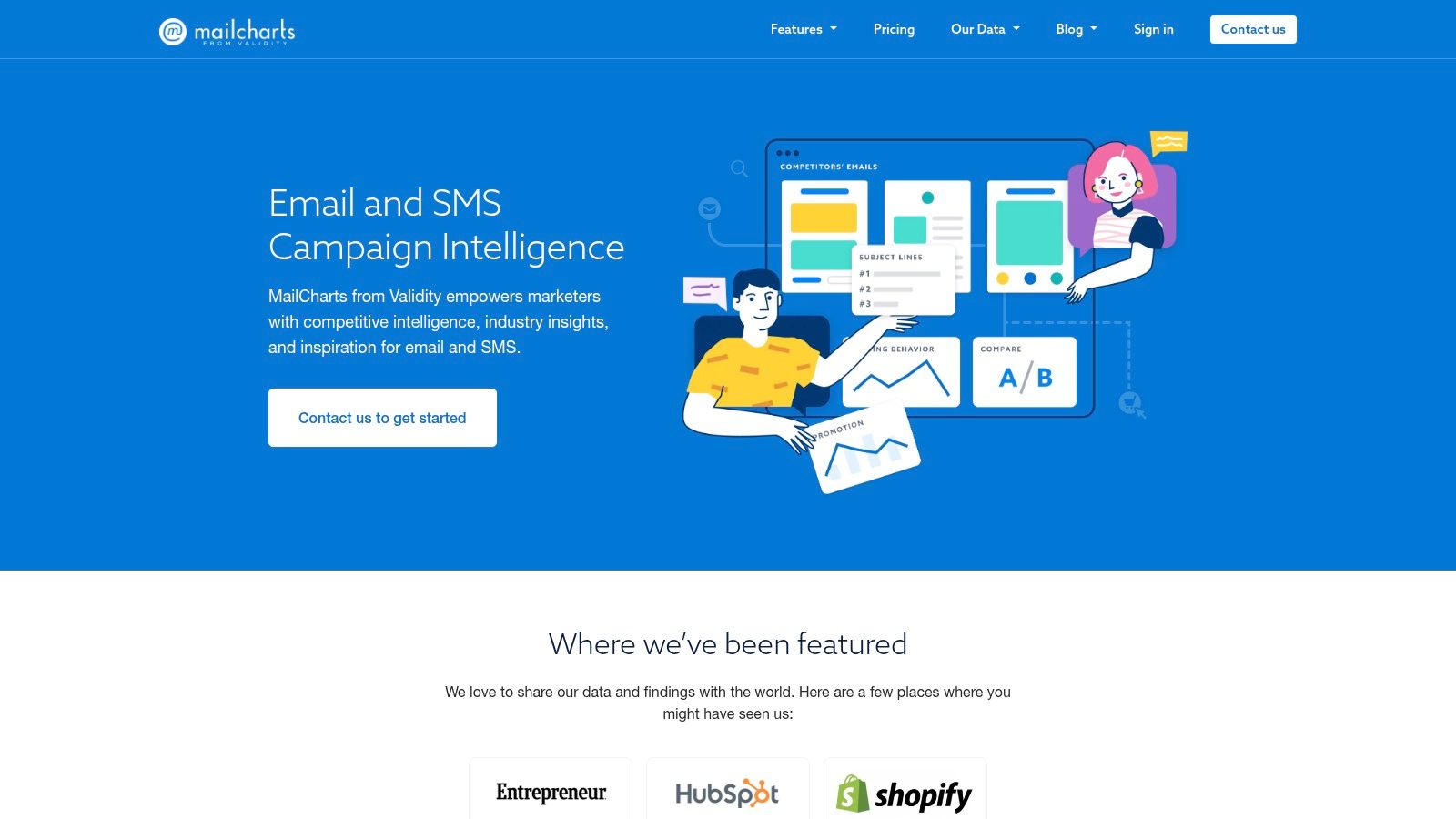
Search or browse examples from tracked brands and industries, with curated picks and lifecycle journeys alongside. Emails open in thumbnail or inbox-style view, and you can save examples to lists for yourself or a team.
The inbox view is the honest view
Thumbnail grids flatter layouts that fail in a real inbox. Switch to inbox-style and you see what a reader sees: sender name, subject line, preheader, and the first two blocks competing for attention. That framing matters for a channel people use constantly and quickly. Ofcom's 2016 Communications Market Report recorded that 57% of UK mobile users said they sent or received email on their phone (Ofcom Communications Market Report 2016).
Read a sequence rather than a single send and the logic matches CRM email design: each message does one job and hands the next one forward. If two emails in a row carry the same CTA and the same hero treatment, one of them is probably redundant.
Pros
Context with the visuals: examples come with cadence and campaign information.
Journey groupings: structured research rather than a scroll.
Shared lists: useful when a team needs one reference set.
Cons
Ecommerce bias: editorial newsletters are under-represented.
Access gates: some research and search sits behind an account or a paid relationship.
Opaque pricing: public pages don't give a clear general price list.
6. Email Gallery
Not every reference needs filters, dashboards or an account. Sometimes you want six things one company sent and a quick read of the craft.
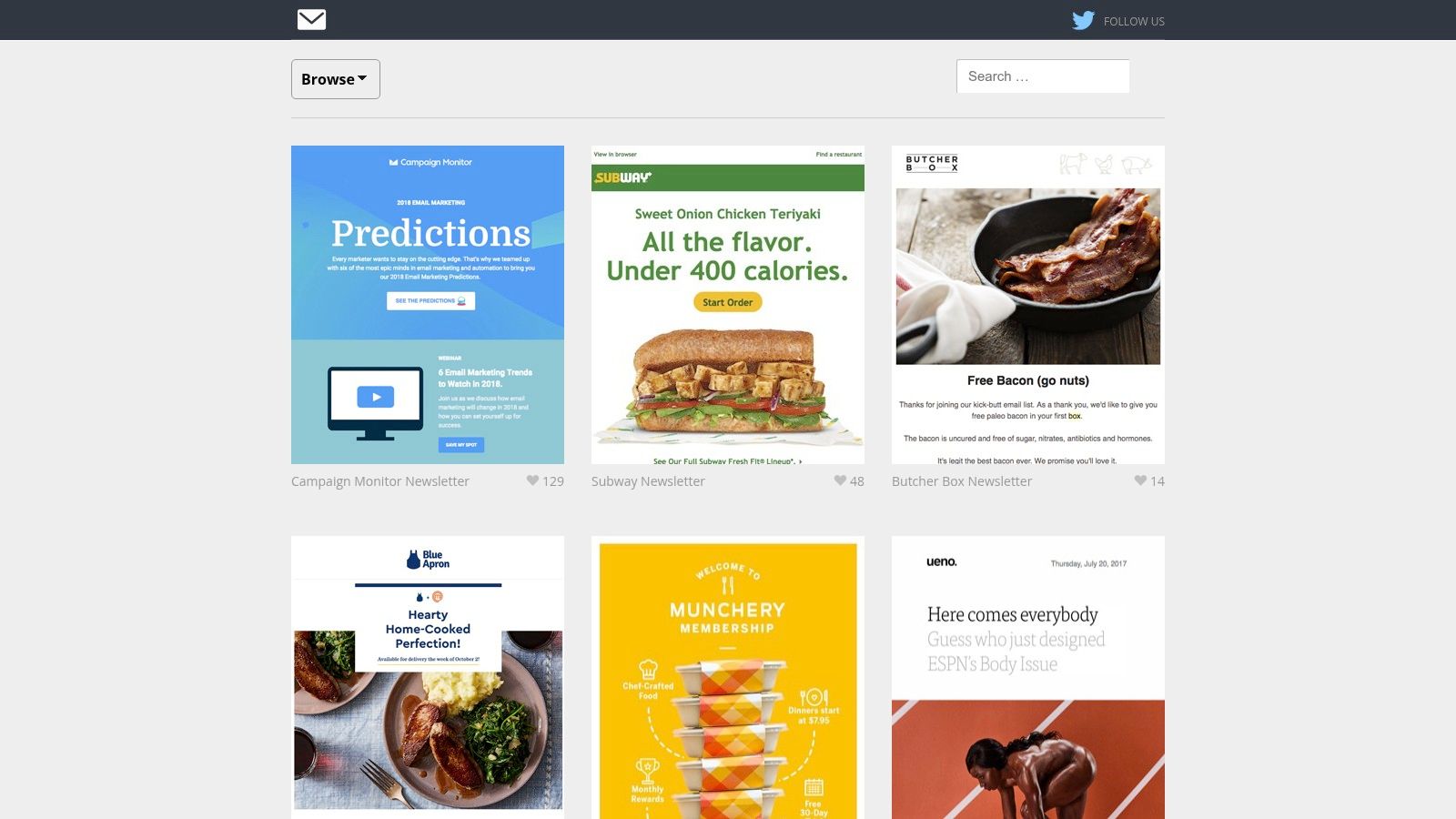
Emails are grouped by company or newsletter collection, covering retail, technology, agencies and other organisations. It's a simple visual library, and it works best as a supplement when the larger archives don't surface the example you need.
Check the date before you borrow anything
Some collections are older, so apply recency as your own filter. An email from a brand's previous identity tells you something about craft, not about what that brand does now. Treat undated examples as historical references.
The bigger caution is that real sends are not automatically good sends. An analysis of 376,348 emails found 99.88% contained at least one serious or critical accessibility issue, with 58% failing colour-contrast checks and about 71% using links without discernible text (accessibility analysis from Spotler). Borrow the structure. Leave the failing footer behind.
Pros
Zero friction: direct browsing with no sign-up.
Brand collections: multiple examples from one sender sit together.
Gap filler: useful when bigger galleries don't have what you need.
Cons
Thin search: fewer filters than Milled or Email Love.
Uneven recency: some collections predate the brand's current practice.
No analysis: no trend or journey data to work from.
7. EmailTuna
This is an archive rather than a curated gallery, which changes how you use it. It's strongest when you already have a sender in mind.
Browse archived newsletters from named brands and inspect the full content, including the parts a screenshot usually crops. Search the archive for a specific company or campaign, and expect fashion, beauty, luxury and retail senders in the mix.
Study the blocks nobody designs
The footer carries most of the compliance weight in a UK send and gets the least attention. The ICO states that recipients must be able to withdraw consent easily, that marketing must stop as soon as possible after withdrawal, and that organisations should keep a suppression list so opted-out contacts aren't reintroduced by a later import (ICO guidance on direct marketing by electronic mail).
Consent language isn't uniform either. The soft opt-in for existing customers only applies where the person bought or negotiated a similar product, was given a simple chance to opt out when their details were collected, and receives an opt-out in every message, while sole traders and certain partnerships must be given an opt-out opportunity even though corporate subscribers are treated differently (ICO guide to PECR on electronic mail marketing). One generic footer rarely serves every segment you send to.
Archive dates vary, so date-stamp anything you save.
Pros
Real brand sends: examples beyond curated selections.
Sender history: useful for tracking one company's past campaigns.
Category coverage: fashion and beauty senders are well represented.
Cons
Variable recency: dates vary, so examples may not reflect current practice.
Archive over analysis: little design commentary.
Unclear pricing: no current price structure is easy to establish.
EmailTuna
How the seven email design inspiration resources compare
Use the table as triage: choose the resource by the decision you need to make, then study real sends for reusable structure rather than scrolling for style.
Item | Best for | Free access | Filtering | Focus |
|---|---|---|---|---|
Campaigns, Steeve Elgui | Seeing consistent campaign design across formats | Portfolio showcase of campaign work | Email, social, and display examples | Ongoing campaign design |
Really Good Emails | Finding email inspiration for a specific campaign brief | Gallery available to browse | Email type and campaign purpose | Real marketing email examples |
Email Love | Researching lifecycle journeys and CRM campaigns | Gallery and insights free to browse; some features require an account | Industry, email type, and style | Email design, trends, and customer journeys |
Milled | Tracking a specific ecommerce or retail brand | Limited free access; advanced features require a paid plan | Brand, keyword, and country | Ecommerce email archive and competitor research |
MailCharts | Comparing campaign design with email strategy | Some features require account access or a paid relationship | Brand, industry, and lifecycle journey | Email intelligence, especially for ecommerce |
Email Gallery | Browsing examples from a particular sender | Simple browsable reference library | Brand or newsletter collections | Visual email references |
EmailTuna | Reviewing a specific brand's past newsletters | Browsable archive of past newsletters | Brand and company search | Archived brand emails, especially retail and fashion |
Pair resources with different jobs. A broad gallery suits pattern spotting for one brief; a sender archive suits checking how a brand repeats modules across a season; a journey-focused library suits CRM work where order matters as much as layout. Keep the set small enough that each example has to defend its place.
Turning Reference Into Repeatable Email Design
Three examples per brief is enough. The instinct is to collect thirty and end up with a moodboard that belongs to nobody, so cap the set and make each one earn its place.
Annotate before you design. For each reference, write one line on layout, one on hierarchy and one on structure: what sits above the fold, how many modules the send uses, where the CTA repeats, how the footer handles preference and unsubscribe. Those notes are what turn a screenshot into a decision you can defend in a review.
A rule that pays for itself: if you can't name the decision you're borrowing in a single sentence, you're borrowing a look.
Then build. Take the strongest pattern from the set and test it against your own content, including the ugly version: a headline two lines longer, a portrait product shot, a longer legal block. A template that only works with perfect content isn't a template.
Measure the test properly. Clicks and click-to-open tell you more than opens, which privacy features distort, and changing one structural variable at a time keeps the result readable. Hero placement, CTA wording and product-card density are all valid single variables.
If a campaign needs outside support, Steeve Elgui works with brands and agencies on CRM email design. A short brief covering the business, goals, the design support needed, budget and preferred timing is enough to start, and a discovery call is the next step.
Steeve Elgui designs CRM email campaigns for beauty, fashion, lifestyle, technology and ecommerce brands, covering responsive layouts, campaign planning and A/B testing, and can extend an existing identity across a single send or a full sequence. If your next brief needs a documented design system rather than one more bespoke template, bring the deadline, the goals and the budget. Visit Steeve Elgui to see the work and start the conversation.
Comments