Shopify Web Designer: What They Do and How to Choose
222,992 Shopify stores are running in the UK, according to BuiltWith's UK technology tracking, against 7,420,338 live Shopify sites worldwide and 9,670,155 when historical use is counted. That gap between live and total is the interesting number. Stores get rebuilt, replatformed and redesigned, which is why a good Shopify web designer tends to become a long-term collaborator rather than a one-off purchase.
The job is usually described as making a store look good. It's broader than that. A Shopify web designer owns the route a shopper takes from a campaign page through a collection, a product, a cart and a checkout, plus the emails and landing pages wrapped around that route. Some of the craft is visual. A lot of it is deciding what a page is for, what survives on a phone, and what the theme will physically allow.
What follows is a plain account of the role: what you're buying, where the designer's responsibility ends and a developer's begins, how Shopify's own ceilings shape the design, and how to brief the work so it doesn't need redoing in six months.
Table of Contents
Shopify Web Design Support Options Compared
Six different kinds of work get sold under one job title, and they solve different problems. Find the row that matches your situation before you read any further.
Support type | Best for | What you receive | Who builds it |
|---|---|---|---|
Theme customisation | Early-stage brands or tight budgets | Homepage, product page and navigation tuned within a solid theme | Designer specifies, developer or theme edits deliver |
Bespoke Figma sections | Editorial storytelling, campaign pages or a distinctive look | Reusable section designs that merchants can assemble into new pages | Designer designs in Figma, developer builds as blocks |
Full store redesign | Brand relaunch or replatforming | User journey map, wireframes, visual system and page templates | Designer and developer together |
Ongoing optimisation | Established stores improving the shopping journey | Review of store data and iterative layout changes after launch | Designer with developer, using analytics the store already collects |
Campaign landing pages | Seasonal launches and promotions | Modular campaign layouts and matching assets | Designer, using existing blocks where possible |
Email and CRM design | Brands running sign-up forms and automated flows | Responsive email templates, flow designs and sign-up form layouts | Designer, who also builds the designs in Klaviyo |
These rows are not rungs on a ladder. A brand can customise a theme this year, add bespoke sections when the campaign calendar fills up, and never commission a full redesign at all. Most ongoing work mixes three or four rows in the same month, which is why the labels on a services page tell you very little on their own.
Ask what you'll physically receive, because the label hides a lot. A designer's output is usually a specification, a prototype or a set of Figma components. The build happens in the theme, in an app or in Klaviyo, and somebody has to own that step. A redesign that ends as a Figma file with no template mapping is half a job, and the half that's missing is the expensive one.
Quick test: name the single page that most needs to change, then find the row that covers it. If you can't name the page, you're not ready to brief anyone.
What a Shopify Web Designer Owns and What Developers Own
Internet sales accounted for 27.1% of total UK retail sales in 2024, according to Office for National Statistics retail sales data, with the quarterly share rising from 26.3% in Q1 to 29.1% in Q4. Put plainly, the navigation, mobile layouts, product presentation, checkout journey and promotional components you commission sit inside a channel carrying roughly a quarter to a third of UK retail activity.
That's the commercial reason to take the boundary seriously. Think of the designer as the architect who plans the rooms, the sightlines and the route through the building, and the developer as the builder who makes those rooms stand up, meet code and keep working under load.
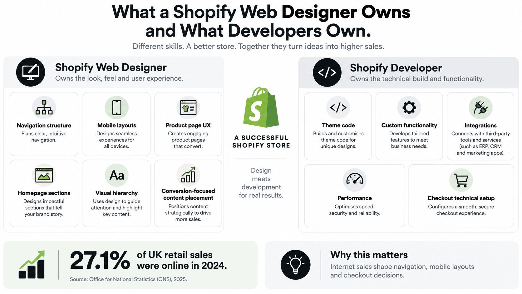
The designer owns the journey map, wireframes, responsive mobile layout, navigation structure, product page hierarchy and brand consistency across the storefront, email and campaign assets. The developer owns theme code, app installation and configuration, checkout limits, performance and the semantic markup screen readers depend on. Accessibility and mobile testing belong to both, and both should sign off before launch rather than discovering the problem in the same week a campaign goes live.
The overlap is where projects go wrong. A designer can draw a filter panel that a theme physically can't render without custom code, and a developer can ship a technically clean template that puts the add-to-cart button below the fold on an iPhone. Designers who work across beauty, fashion, lifestyle, technology and ecommerce brands learn to ask about implementation before they get attached to a layout.
Bring two questions to any candidate. Who signs off the product page template, and who maintains it after launch? If the answer is vague on either, keep looking.
Customising a Theme or Designing Bespoke Sections
If the brand is early-stage or the budget is tight, customise a solid theme and spend the effort where it changes behaviour: the homepage, the product page and the navigation. Those three carry most of the early decisions a shopper makes, and polishing a checkout page nobody reaches is wasted money.

Three signals tell you when to switch to bespoke sections designed in Figma and built as reusable blocks:
Brand stage: once the store has to hold a story (an artist collaboration, a seasonal concept, a founder narrative), fixed theme layouts start looking like a template rather than a brand.
Campaign volume: two launches a quarter is a theme job. Six a quarter means you're rebuilding layouts repeatedly, and that's when a block library pays for itself.
Request frequency: count how often the team asks for a new page layout. Occasional requests are fine to absorb. The same request coming back every month is a design-system problem wearing a content costume.
Shopify's theme editor is flexible but not universal, and this is what catches people out. Merchants can add, remove and rearrange sections on most storefront templates, but Shopify's theme structure documentation confirms that gift-card and checkout pages sit outside that model. Sections without presets can't be added through the editor at all, and sections placed in JSON templates without presets can't be removed there, only hidden.
That single fact reshapes how bespoke work gets planned. Reusable sections need presets and template availability designed in from the outset, not bolted on after the look is approved. Restricted areas such as checkout may need Shopify-supported extensions or a different implementation route entirely.
Decision rule: keep customising while layout requests are occasional. Move to reusable sections the moment the same layout request comes back a second time.
Designing Flexible Sections Around Shopify Theme Limits
Say a luxury fashion label needs a Shopify store that carries the brand and still sells. The art direction and UX/UI work covers a collection-led homepage, an artist page and an events section, all of which have to move a shopper toward a product page without making them read first.
The design answer is a small system of sections that mix editorial content and product grids on the same page. A campaign image sits beside a shoppable row, an events panel links straight to the collection it promotes, and an artist profile ends with the pieces that artist wears. Storytelling and shopping share a layout, and the brand team can assemble a new page without commissioning custom code for every launch.
Shopify supports all of that within fixed ceilings, and every ceiling should change what you draw. These come from Shopify's theme architecture limits:
Limit | Value | What it means for design |
|---|---|---|
JSON templates per theme | 1,000 | Reuse templates rather than building one per campaign |
Sections per JSON template | 25 | Plan page layouts within this ceiling |
Blocks per section | 50 | Keep individual sections focused on one job |
Blocks per template | 1,250 | Build a small block library rather than a unique template per campaign |
Block files per theme | 300 | Build a small, named block library |
Nested block levels | 8 | Avoid deep nesting that slows editing |
Section group files per theme | 20 | Use groups for shared navigation and promotional modules |
Sections per section group | 25 | Keep shared groups manageable |
Compressed theme package | 50 MB | Optimise images and assets before upload |
Dynamic sources per template | 100 | Pull product and collection data rather than typing it |
That 1,250-block ceiling is set out in Shopify's sections and blocks documentation, which also allows up to 100 dynamic sources per template so section content can pull from product, collection or metaobject data instead of being retyped by hand.
Section groups do the maintenance work, and Shopify's section architecture reference confirms a section added to a group repeats across every template where that group renders, with up to 20 group files per theme and 25 sections in each. That's how shared navigation, promotional messaging and campaign modules stay centrally editable instead of drifting into six near-identical copies.
Naming rule: name blocks by function, not by campaign. Campaign image, artist profile, event details, product grid, editorial text. A block called "SS25 hero v3" is dead the moment the season ends.
Keep the library small and check the limits before handover, not after a developer has already hit an error in the theme editor.
Apps and Integrations Your Design Must Plan For
Every third-party tool takes layout space, and the ones bolted on after launch are the ones that break a design. Reserve the space in the first pass.
Klaviyo does two jobs that both need designing: the sign-up form on the storefront, and the flows that arrive afterwards. Decide where capture appears and when (an exit-intent overlay on desktop, an inline block above the footer on mobile), then design the templates that follow so the form's promise and the first email match. This is the same discipline as the rest of your CRM and email design work, not a separate project.
Meta Pixel, set up through Shopify Customer Events, renders nothing visible. It still shapes two design decisions: the consent banner has to sit where it won't cover the add-to-cart or a sticky mobile bar, and the team needs to know which events fire, because a pixel that isn't recording add-to-cart will report a funnel that looks broken.
Hotjar recordings and heatmaps come after launch. They show where shoppers stop scrolling, which section gets skipped and where a filter gets abandoned, and they feed directly back into layout changes.
Reviews need space reserved in product cards and on product pages from day one. Star ratings, review counts and review blocks added later push the add-to-cart button off a phone screen, and that's a conversion problem nobody attributes to the right cause.
Consent banners need a fixed position tested on small screens, because a banner that expands over the primary button is the most expensive free tool on the site.
Three questions apply to every one of them: where does it render, does it load on the homepage, and what happens on a phone?
Mobile and Accessibility Requirements for Shopify Design
Mobile-first is a commercial requirement, not a stylistic preference. Baymard's mobile ecommerce usability research reports that mobile traffic commonly accounts for about 50% of ecommerce traffic, while mobile sites can convert at less than half the rate of desktop when usability is weak.
The cause is cumulative friction rather than one broken element. Dense navigation, small tap targets, slow or unstable product media, awkward variant selection, excessive form fields and checkout interruptions stack on top of each other. Prototype the whole mobile purchase path in Figma, from landing page and collection filters through product options, cart and checkout, then test it on a physical iOS and an Android device before handover.
Accessibility needs the same end-to-end treatment. A UK audit reported by The Grocer found that 33 of 44 major retailer websites had at least one critical or serious accessibility failure on the homepage, while Click-Away Pound research cited in the same reporting found that 69% of disabled internet users abandoned websites when they hit barriers.
Audit the journey as one flow: filters, variant selectors, quick view, cart drawer, pop-ups and any review or subscription app. The baseline is WCAG-oriented work, meaning logical heading order, keyboard-operable menus and filters, visible focus states, descriptive link and button labels, text alternatives for meaningful product imagery, sufficient colour contrast and correctly associated form errors.
Deliverable to ask for: an accessibility statement plus a prioritised remediation list that separates design fixes from developer work and app-vendor work.
That list matters because the accountability gap is real. QualiBooth's 2025 ecommerce accessibility report found the UK averaged a score of 75 while Shopify Plus averaged 68, and only 67% of UK retailers published an accessibility statement. Ask any candidate to show how they check each of these before sign-off, on real devices, not in a browser window resized to 375 pixels. The wider UX/UI process behind this work should include screen-reader passes on the homepage, collection, product, cart and account templates.
Fit, Scope and Next Steps Before Briefing a Designer
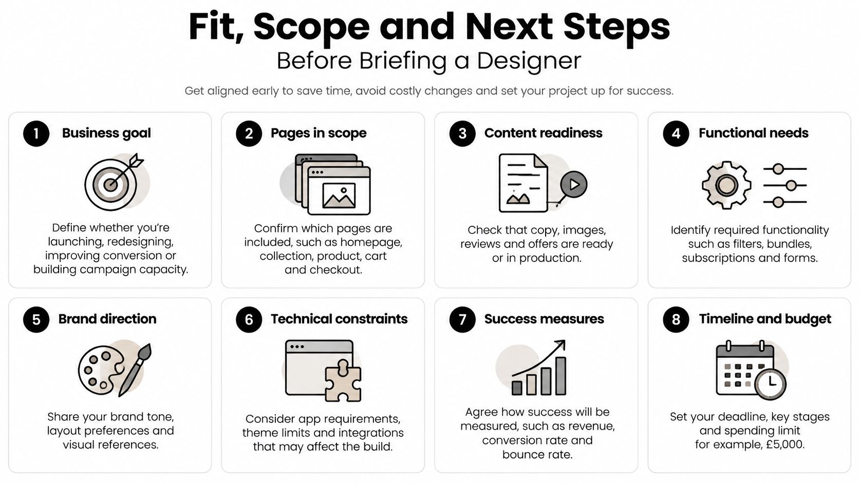
Most briefs that stall do so before a designer is involved. The budget wasn't framed against scope, the photography didn't exist, or nobody had decided who signs off the homepage. Answer eight questions first and the conversation gets short and useful.
Start with the goal and the pages
Name the business goal in one line: launch, redesign, conversion improvement or more campaign capacity. Those four lead to different deliverables, and a brief that asks for all of them at once usually gets none.
Then list the pages in scope, explicitly: homepage, collection, product, cart, checkout, landing pages, email flows. Vague scope is the main reason quotes come back high, because a designer prices the ambiguity as risk.
Take stock of what you already have
Content readiness is the quiet killer. Do you hold finished photography, product copy, attributes, reviews and offer mechanics, or is the design expected to work with placeholders? Integrations already live come next, since apps, pixel tracking and consent tooling constrain layout. Brand direction rounds it out, and if the identity itself is inconsistent across channels, that's branding work running alongside the store design rather than an afterthought.
Agree the process before the price
Timing and the number of review rounds should be settled before the third week of the project. The budget range and how it maps to scope should be clear too. Decide who signs off, because a project with four approvers has four times the iterations and one deadline.
For ongoing support, the useful move is to send an outline of the work, the expected volume and how often help is needed, so availability and fit can be confirmed rather than promised optimistically.
Four actions, in order:
Write the one-page scope note. Goal, pages, content, integrations, timing, budget, sign-off.
List the three pages that most need change. Ranked, not alphabetised.
Choose the support type from the table at the top and name what you expect to receive at the end.
Book a discovery call and talk through the pages before anyone designs anything.
A short brief is enough to start, covering the business, the goals, the design support needed, the budget and preferred timing. Expect questions back about existing materials, the review process and deadlines, because those three set both cost and schedule.
Steeve Elgui is a senior freelance designer in London who designs Shopify stores end to end, from journey maps and wireframes through product pages, reusable sections, Klaviyo email templates and campaign assets, for beauty, fashion, lifestyle, technology and ecommerce brands. If you're weighing theme customisation against bespoke sections, or you need someone to own the whole purchase journey across store and email, you can see the work and get in touch here. Bring a short brief and a rough budget, and you'll get a straight answer on scope, timing and whether the project is the right fit.
Comments