10-Step Website Redesign Checklist for 2026
Your retail team has approved a striking new homepage. The campaign imagery looks sharp, everyone likes the typography, and the launch date is already in the marketing calendar. Then someone checks the migration spreadsheet and discovers that valuable organic landing pages don't have a place on the new site.
The design wasn't the problem. The team approved visual decisions before agreeing what needed protecting, what visitors needed to do and how the website connected to everything around it.
That's why most redesigns stall before the first mockup, even if the delay only becomes visible during development. Unanswered questions about content, ownership, integrations and measurement eventually become urgent decisions. By then, changing direction means revisiting approved work.
A useful website redesign checklist follows the order in which those decisions depend on one another. Evidence comes before scope. Journeys come before layouts. Content, accessibility and performance shape the design rather than arriving as corrections before launch.
The website also isn't an isolated brand asset. Someone might arrive from a Klaviyo email, scan a code on packaging or follow a paid campaign promising a particular offer. The redesigned experience needs to honour that promise all the way through to confirmation.
Work through these tasks in sequence, but involve designers, developers, content owners and marketing colleagues throughout. You're not passing a finished document between departments. You're agreeing what to build before expensive assumptions become finished pages.
Table of Contents
2. Define Clear Goals, Audiences and Success Metrics - Agree what success actually means
3. Map User Journeys and Restructure Information Architecture - Test the structure before styling it
5. Build a Visual Design System Aligned With the Brand - Build for the next campaign
6. Design Mobile-First, Responsive and Accessible Experiences - Make accessibility an acceptance requirement
7. Plan Content Strategy, Migration and Search Preservation - Treat migration as a controlled change
8. Optimise Performance and Core Web Vitals - Design the lighter version first
9. Optimise Conversion Paths, Calls to Action and Forms - Match the promise to the action
10. Test, Launch and Measure Performance After Go-Live - Agree release and recovery responsibilities
How the ten redesign tasks compare by output, owner and timing
Turn the Checklist Into a Launch Plan You Can Trust - Turn tasks into accountable deliverables - Brief the project around reality
1. Audit the Current Website and Its Analytics
Start by identifying what must survive the redesign, not what looks dated. A productive audit separates valuable pages and working journeys from genuine obstacles.
Export analytics across a complete seasonal cycle where available. Review traffic sources, landing pages, conversion events, engagement, exits and device differences, then compare those findings with Google Search Console. Check tracking quality before treating any dashboard as definitive.
Build a content inventory alongside a technical crawl. Record each URL, its purpose, owner, search visibility, internal links and proposed action: retain, improve, merge or retire.
Behavioural evidence: Use Hotjar heatmaps and session recordings to identify repeated hesitation, missed controls and frustrating interactions.
Technical condition: Check broken links, indexability, template errors, mobile behaviour and dependencies on ageing plugins or integrations.
Customer questions: Ask sales and customer service which details visitors can't find or routinely misunderstand.
Brand consistency: Compare the site with live emails, campaign landing pages, packaging and printed materials.
Say a fashion retailer notices shoppers repeatedly tapping a size-guide label that isn't interactive. The useful finding isn't that the product page needs a cleaner look. It's that shoppers expect sizing help at the point of selection.
Capture the audit workflow before assigning fixes.
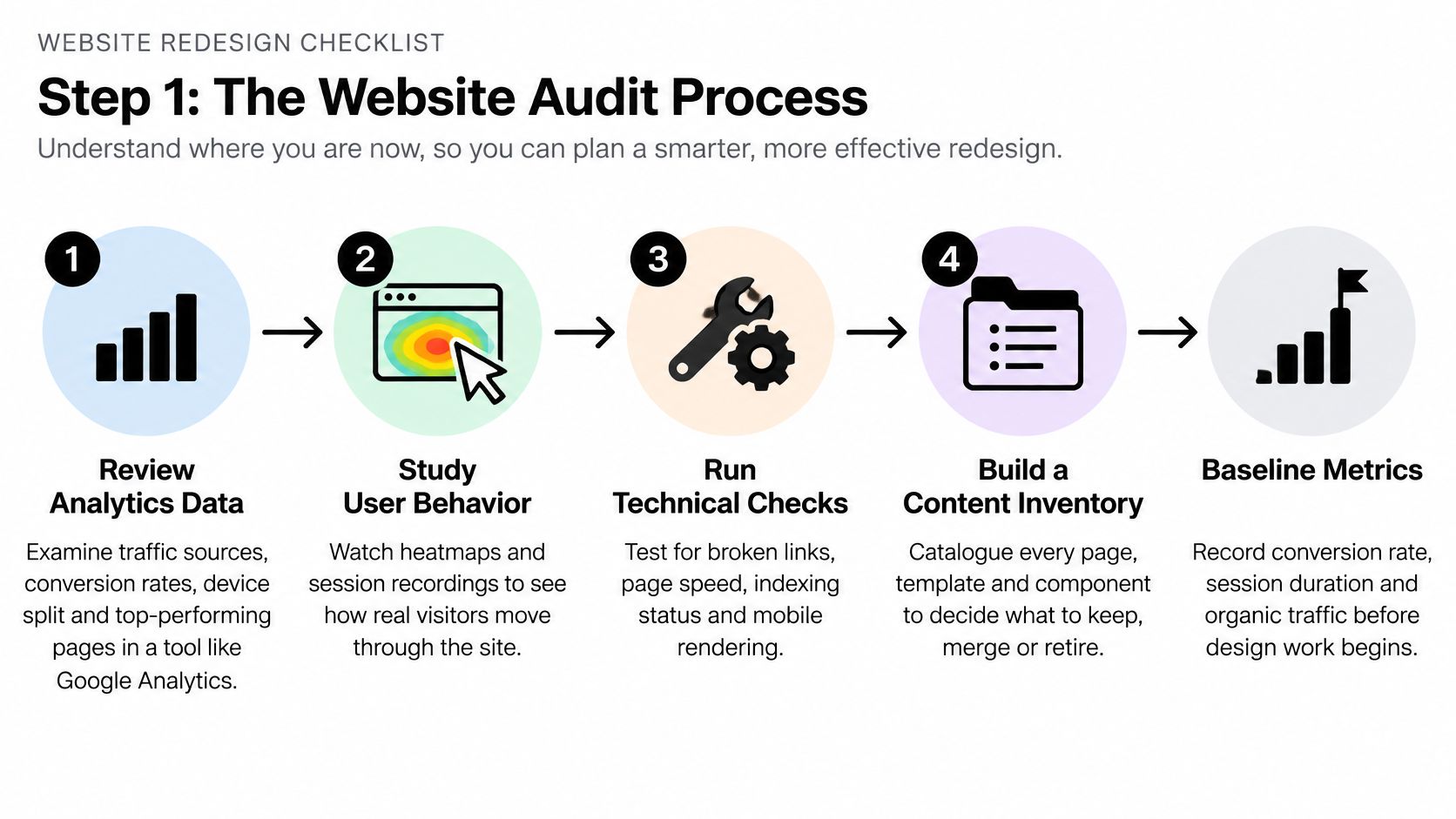
Save the baseline in a shared document, including metric definitions and reporting filters. Without that record, the team can't reliably distinguish an improvement from a change in measurement.
2. Define Clear Goals, Audiences and Success Metrics
A better-looking website is a design ambition, not an acceptance criterion. Translate it into a business outcome and a user task before approving scope.
For a cosmetics brand, that might mean helping first-time visitors choose a suitable sample and complete the request. For a technology business, it might mean separating prospective customers looking for a demonstration from existing customers seeking support.
Write each objective with a baseline, an agreed target, a deadline and a named owner. Choose targets using your own commercial requirements and audit findings, rather than borrowing an impressive percentage from another business.
Agree what success actually means
Primary outcomes might include qualified enquiries, completed purchases or successful bookings. Diagnostic measures explain those outcomes: form errors, checkout progression, search usage and task completion during testing.
Include guardrails too. More enquiries aren't useful if sales rejects them, and more orders aren't an unqualified success if payment failures or support requests increase.
Decision filter: If a proposed feature doesn't support a priority user task, a business objective or a necessary operational requirement, challenge its place in the launch scope.
Ask marketing, sales, customer service and delivery teams to review the brief. Leadership should resolve competing priorities, not leave the designer to infer which department matters most.
Document assumptions separately from facts. A belief that customers need a product quiz is something to test, not an automatic requirement.
Finish with an agreed decision-maker and feedback process. Consolidated feedback prevents the project becoming a sequence of contradictory preferences disguised as refinements.
3. Map User Journeys and Restructure Information Architecture
Say a skincare customer clicks an email about sensitive skin, lands on a generic category page and has to restart their search. The email and website might look consistent, but the journey still fails.
Map the customer's task from its actual starting point. Include the advert, email, search result or printed QR code, then follow the path through discovery, evaluation, action and follow-up.
Ofcom's account of UK online habits in 2025 puts average daily time online at four and a half hours, reinforcing the importance of considering connected touchpoints rather than the homepage alone.
Use a shared journey map to make those handovers visible.

Test the structure before styling it
Organise content around what visitors recognise and need to accomplish. Internal department names, campaign slogans and clever category labels are poor navigation choices when customers don't understand them.
Create a sitemap: Show page relationships, utility navigation and routes to support.
Run tree testing: Ask representative users where they'd look for specific information without showing visual design.
Check cross-channel continuity: Preserve offer wording, product terminology and eligibility details from email or print to landing page.
Plan recovery routes: Give visitors useful alternatives when search returns nothing or a product is unavailable.
For the skincare example, a dedicated landing page might be appropriate. Equally, clearer category labels and a relevant filtered destination might solve the problem without adding another page to maintain.
4. Create Wireframes and Interactive Prototypes
Don't commission polished screens for every page before testing the main journey. Start with the flow where confusion would most directly prevent someone completing their task.
Wireframes establish hierarchy, content requirements and interaction patterns. An interactive Figma prototype lets users attempt the journey, exposing gaps that static presentations can conceal.
For a fashion product page, prototype selecting a size, checking availability, opening sizing guidance and adding the item to the basket. Include unavailable variants and validation messages, not just the successful route.
Use realistic content: Long product names, awkward prices and detailed delivery messages reveal layout weaknesses.
Keep early screens restrained: Greyscale helps reviewers discuss priority and functionality before debating colour.
Label review status: Distinguish exploratory layouts from approved flows and implementation-ready specifications.
Show responsive behaviour: Design narrow and wide layouts together, including menus, overlays and form states.
A useful UX/UI design process connects journey mapping, wireframes and component decisions rather than treating them as unrelated deliverables.
Use the walkthrough below as a prompt for discussing how an interactive experience is assembled and reviewed.
Ask test participants to complete a task without coaching them towards the intended control. If they hesitate, record what happened before explaining the design.
Approve the behaviour before polishing the presentation. Otherwise, the team becomes attached to an attractive solution that still needs structural changes.
5. Build a Visual Design System Aligned With the Brand
A design system shouldn't be a gallery of buttons that nobody knows how to use. It should give designers, developers and marketing colleagues practical rules for producing consistent work.
Start with typography, colour roles, spacing, layout principles and essential components. Define primary actions, secondary actions, form fields, navigation, product cards and feedback messages, including their interactive states.
Separate brand principles from channel-specific execution. An email button and a website button should feel related, but they don't need identical implementation. Print assets need their own production specifications rather than copied screen values.
Build for the next campaign
Consider a beauty brand preparing a seasonal promotion. The website hero, CRM email, paid social assets and printed insert should share recognisable art direction, offer wording and hierarchy without forcing the same composition into every format.
Good branding and identity foundations make those adaptations coherent. Document image treatment, logo placement, typography, colour usage and examples of unsuitable combinations.
Build only necessary components: Add patterns when a real content or interaction need justifies them.
Document intended use: Explain when a component applies, what content it accepts and how it behaves.
Assign maintenance: Name who approves changes and updates the shared Figma library.
Check implementation: Compare coded components with approved designs before teams duplicate inconsistencies.
Preserve recognisable assets that still work. A redesign doesn't need a new visual identity simply to demonstrate that something has changed.
The trade-off is deliberate: fewer well-defined patterns offer less visual freedom, but make campaign production and ongoing maintenance more manageable.
6. Design Mobile-First, Responsive and Accessible Experiences
Mobile-first design means prioritising the task on a small screen, not shrinking the desktop composition. Ofcom's Online Nation 2025 report found that smartphones accounted for 77% of time spent online by UK online adults during an average day.
Test navigation, product discovery, forms and essential actions on real phones. Check readable type, touch targets, orientation changes, sticky elements and whether the on-screen keyboard obscures controls.
Accessibility needs the same early attention. Government Digital Service monitoring between January 2022 and September 2024 found accessibility issues on nearly all tested public-sector websites and apps, and monitoring moved to WCAG 2.2 from October 2024.
Make accessibility an acceptance requirement
Record the applicable accessibility target, including WCAG 2.2 AA where appropriate, and test representative journeys throughout delivery. Automated scans help, but they don't replace manual checks or testing with disabled users.
Keyboard operation: Verify logical focus order, visible focus and usable menus, dialogs and controls.
Content clarity: Check headings, meaningful links, alternative text and captions where needed.
Forms: Provide persistent labels, understandable errors and a clear recovery path.
Assistive technology: Test key templates with VoiceOver or NVDA and check mobile screen-reader journeys.
For a beauty site, ensure shade selection isn't communicated through colour alone. Apply the same thinking to promotional emails so customers can understand the offer before reaching the website.
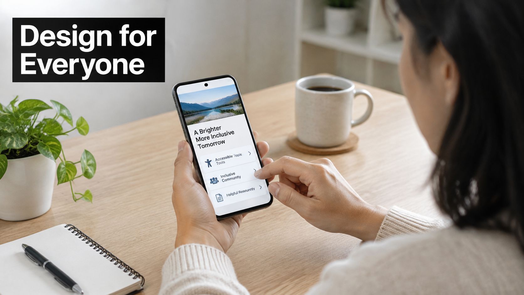
Review the mobile experience as an interaction, not a screenshot.
7. Plan Content Strategy, Migration and Search Preservation
A redesigned page still needs to answer the visitor's question. Write and approve real content before final layout approval, especially where product details, service explanations or eligibility conditions determine the page structure.
Give every existing URL a documented destination or retirement decision. Combine a crawl with Search Console exports, analytics landing pages, backlink information and CMS records rather than relying on a single inventory.
For each retained page, record its user purpose, primary search topic, headings, metadata, internal links and content owner. Preserve useful detail instead of replacing specific answers with short brand statements.
Treat migration as a controlled change
Say a cosmetics brand has overlapping guides to choosing foundation. Consolidation may help readers, but only if the replacement covers the useful material and satisfies the same intent.
Map changed URLs: Use permanent redirects to relevant replacements, not a blanket route to the homepage.
Check staging: Test destinations, redirect chains, canonicals, metadata and internal links.
Protect campaign destinations: Update email templates, paid adverts and printed QR-code destinations where possible.
Validate launch settings: Check robots directives, XML sitemaps and accidental staging restrictions.
Migration warning: A page isn't safe to remove just because it looks old. Check its traffic, backlinks, customer value and replacement before retiring it.
Keep a copy of the old content and URL map so the team can investigate discrepancies after launch. Search preservation isn't a promise that rankings won't move; it's the disciplined work of avoiding preventable losses while making the new structure easier to understand.
8. Optimise Performance and Core Web Vitals
An oversized campaign image and an unnecessary tracking script are design and marketing decisions as much as technical ones. Give the developer a performance budget while layouts are still flexible.
Largest Contentful Paint concerns loading, Interaction to Next Paint concerns responsiveness, and Cumulative Layout Shift concerns visual stability. Use PageSpeed Insights to diagnose individual pages and the Chrome User Experience Report for available real-user evidence.
Mobile connections deserve explicit attention. Ofcom's Communications Market Report 2024 recorded average monthly mobile data consumption of 9.9 GB per mobile data user in 2023, supporting deliberate testing beyond office Wi-Fi.
Design the lighter version first
For a lifestyle homepage, compare an optimised still image with an automatically playing background video. If the video doesn't communicate something essential, don't make every visitor download it for atmosphere.
Prepare responsive images: Supply appropriate dimensions and formats, and reserve space to prevent movement during loading.
Prioritise visible content: Don't lazy-load the main image visitors need immediately; defer suitable below-the-fold media.
Control fonts: Limit unnecessary families and weights, and check fallback behaviour.
Audit scripts: Confirm an owner and purpose for analytics, chat, CRM and campaign integrations.
Test image-heavy product pages, filtering and promotional landing pages separately. A fast homepage doesn't prove that the checkout or product gallery responds well.
Repeat testing after content migration and marketing integrations are installed. A lightweight prototype can become a slow production site when real imagery, consent tools and campaign scripts arrive.
9. Optimise Conversion Paths, Calls to Action and Forms
At the point of action, remove uncertainty before adding persuasion. Visitors need to know what happens next, what it costs and what information they must provide.
In ONS analysis using aggregated and anonymised UK Visa card-payment data, online spending accounted for 50.5% of total card spending in September 2025. The purchasing journey deserves the same design attention as the brand presentation.
For ecommerce, check sterling formatting, applicable tax clarity, delivery expectations, returns, address entry, payment failures and confirmation messages. For enquiries, explain the next step and request only information needed to handle it.
Match the promise to the action
A sample campaign should lead to a relevant sample page, not a generic contact form. A button labelled Get my sample should initiate that request rather than unexpectedly asking visitors to browse the full range.
Prioritise the action: Make the main next step visually clear without making supporting information inaccessible.
Reduce form friction: Use appropriate input types, autofill and persistent field labels.
Place reassurance nearby: Put delivery, privacy or eligibility details where users make the decision.
Track progression: Validate form starts, errors, submissions, payment outcomes and confirmation events.
Coordinate CRM and email design with the website journey so offer language, consent wording and follow-up remain consistent.
Test the full form interaction, including unsuccessful submissions.

Don't assume shorter is always better. Keep information that visitors need to choose confidently, and remove fields or distractions that serve no immediate purpose.
10. Test, Launch and Measure Performance After Go-Live
Launch approval should depend on evidence, not exhaustion. Maintain a shared defect log with severity, owner, reproduction steps and retest status.
Test complete journeys across representative browsers and devices, including keyboard operation, failed payments, unavailable products, form errors and confirmation emails. Confirm that analytics records the right events without duplicates or inappropriate personal information.
For a cosmetics launch tied to an email campaign, place a test order from the actual email link. Check tracking parameters, discount eligibility, basket behaviour, payment and post-purchase messages as one connected experience.
Agree release and recovery responsibilities
Prepare the release: Confirm backups, access, deployment ownership, integrations and the final content freeze.
Set rollback conditions: Define which failures require reversal and test the recovery process.
Control campaign timing: Avoid directing a major promotion towards an unverified release.
Monitor meaningful signals: Review errors, orders, enquiries, search visibility, accessibility defects and support contacts.
Compare post-launch results with the original baseline using consistent definitions. Segment by device, traffic source and customer type so an aggregate improvement doesn't conceal a damaged journey.
Run controlled experiments where traffic and sample quality support a reliable conclusion. Otherwise, combine usability testing, customer feedback and directional performance evidence rather than declaring a winner prematurely.
Launch gate: Known limitations can be manageable. Unowned limitations, missing tracking and an untested recovery plan aren't an acceptable handover.
Schedule formal reviews and assign ongoing ownership. The redesign is ready for normal operation when the team can maintain the system, recognise problems and make improvements without reconstructing the project's decisions.
How the ten redesign tasks compare by output, owner and timing
Item | Main Output | Team Involved | Best Timing |
|---|---|---|---|
Audit the Current Website and Its Analytics | Evidence-based site audit and baseline metrics | Analytics, UX, SEO, content, development | Before planning the redesign |
Define Clear Goals, Audiences and Success Metrics | Project brief, audience priorities and KPIs | Leadership, marketing, sales, customer service, design | At project kickoff |
Map User Journeys and Restructure Information Architecture | Journey maps, sitemap and navigation structure | UX research, content, SEO, marketing | After goals are set, before visual design |
Create Wireframes and Interactive Prototypes | Page layouts, clickable prototypes and specifications | UX/UI design, product, stakeholders, development | After journeys and structure are defined |
Build a Visual Design System Aligned With the Brand | Reusable components, visual rules and brand guidelines | Brand, UX/UI design, development, marketing | During design, before full-scale page production |
Design Mobile-First, Responsive and Accessible Experiences | Responsive, accessible designs and interaction patterns | UX/UI design, accessibility specialists, development, QA | From the start of design through testing |
Plan Content Strategy, Migration and Search Preservation | Content plan, URL map, redirects and updated metadata | Content, SEO, development, marketing | Before content production and well ahead of launch |
Optimise Performance and Core Web Vitals | Performance budget and optimised site assets and code | Development, design, SEO, analytics | From early design through development |
Optimise Conversion Paths, Calls to Action and Forms | Clear conversion flows, calls to action and streamlined forms | UX/UI design, marketing, analytics, development | During design and before launch testing |
Test, Launch and Measure Performance After Go-Live | QA results, launch plan and post-launch performance dashboard | QA, development, analytics, SEO, marketing, stakeholders | Before launch and throughout post-launch reviews |
Turn the Checklist Into a Launch Plan You Can Trust
A dependable website redesign checklist is more than a collection of tasks. It connects each decision to the evidence, people and deliverables needed to make the next decision safely.
The sequence matters, but it isn't a rigid waterfall. Developers should review prototypes, content owners should shape layouts, and accessibility testing should influence components before anyone declares the design finished. Return to earlier decisions when testing exposes a problem, rather than protecting an approval that no longer makes sense.
Turn tasks into accountable deliverables
Give each task an owner, an acceptance condition and a place in the schedule. An audit is complete when its findings support scope decisions, not when someone has exported a report; a migration is ready when destinations have been tested, not when a spreadsheet contains URLs.
Use practical release conditions:
Evidence agreed: The team understands what performs well, what needs fixing and how success will be measured.
Experience validated: Priority journeys work with real content across relevant devices and input methods.
Brand connected: Website, email, campaign and print touchpoints use consistent promises and recognisable design.
Operations prepared: Content owners can publish safely, defects have owners and recovery responsibilities are clear.
Be equally clear about what won't launch. A selective upgrade can be the right decision when existing content, navigation or conversion paths already work. Preserve those strengths and direct effort towards the parts customers struggle with.
Brief the project around reality
Start with your target launch date, audit findings, business goals and available materials. Add your budget indication, required support and review process so the scope reflects the work your team can realistically deliver.
At our London-based practice, we begin with a short brief and discuss scope, availability and a realistic schedule around the preferred timing. Project costs depend on the deliverables and level of involvement required, rather than a generic website package.
Don't treat the launch date as the only commitment that matters. Agree who will review performance, maintain components and resolve accessibility or content regressions after release. That's how a redesign becomes a working system rather than a polished handover that nobody owns.
Steeve Elgui offers UX/UI, branding, CRM email and digital campaign design to help connect your website redesign with the wider customer experience. Visit Steeve Elgui to explore the approach, then book a discovery call with your goals, current website and preferred launch timing so we can discuss a practical scope.
Comments