Brand Identity Design: A Practical Guide for UK Brands
Cover the logo at the top of your homepage. Would a customer still know the page belonged to you?
For most brands the honest answer is no, and that answer exposes the gap in how people talk about brand identity design. The conversation stops at the mark, maybe the colour, and everything else gets left to whoever builds the next asset. Then the website, the emails, the packaging and the campaign banners drift apart, and customers feel the inconsistency long before anyone measures it.
Identity is a system, and it's also a trust instrument. It decides whether someone believes your delivery promise, your ingredient list, your returns policy, and whether they recognise you on a shelf, in an inbox and on a product page as the same organisation. The route from a single mark to a working system runs through six components, five touchpoints, a set of contrast thresholds and a decision about who builds it.
Table of Contents
The Core Visual Components and What Each Does - The hierarchy, from fastest to slowest - A five-second test for any asset
Colour and Type Rules That Pass Accessibility Checks - Why a swatch passes and a button fails - The legal frame for public sector work - Turning colour into rules
Brand Examples From Beauty and Fashion Identities - A live beauty site - A fashion label with a contrast problem - A technology brand with two button styles
What Brand Identity Design Covers and Why It Matters
Brand identity design is the deliberate system of visual choices that makes a brand recognisable before anyone reads a word: the logo, the colour palette, the typography, the imagery, the layout, and the rules that hold all of it together.
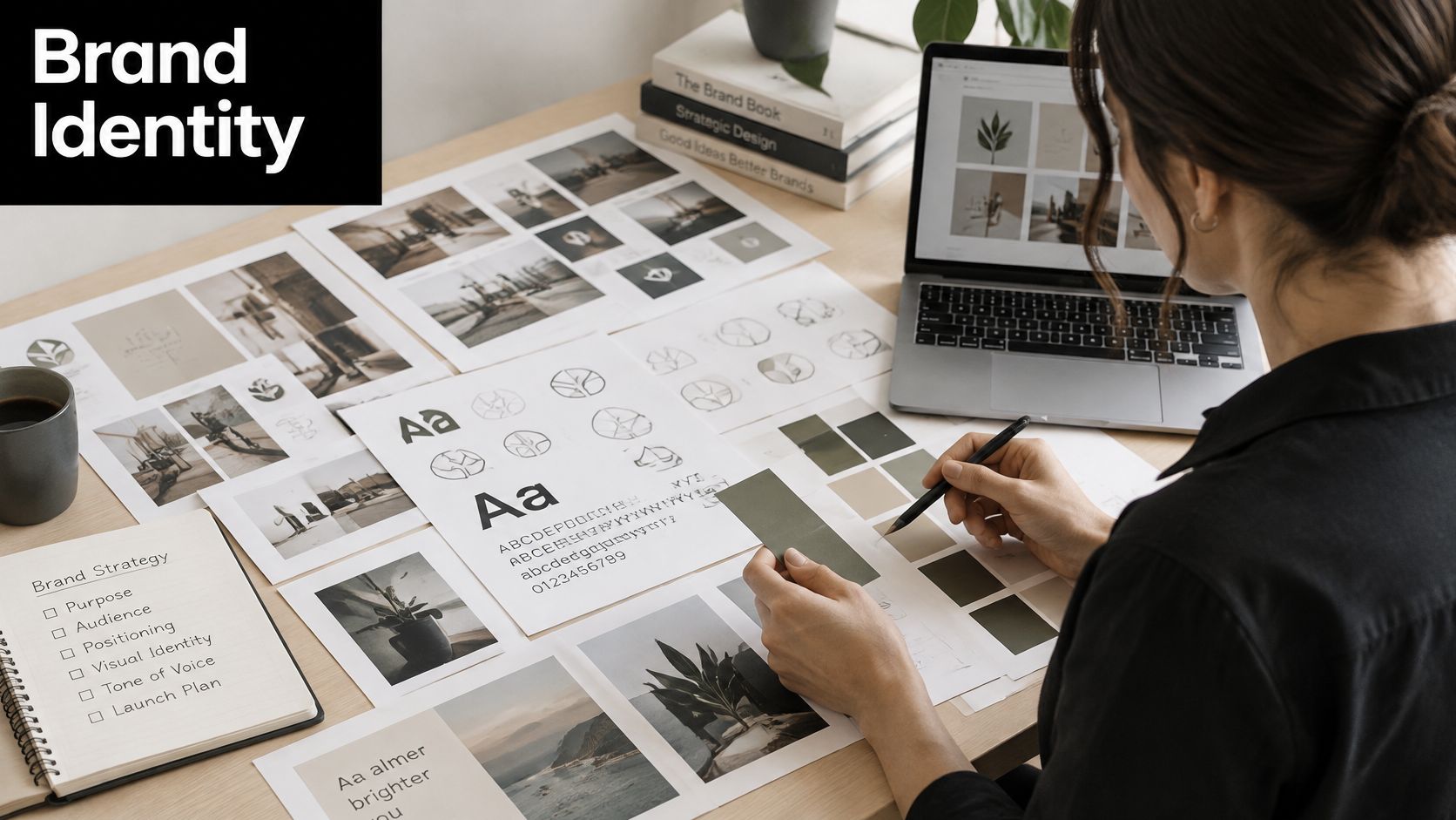
Think of it as a uniform and a handwriting. A school uniform is identifiable across a crowded room at a distance. The handwriting is identifiable on a note with no signature at all. The logo is one garment in the wardrobe. It matters, but a jacket isn't a wardrobe.
The distinction that matters: the logo is a garment. The identity is the uniform, the handwriting and the house style taken together.
Three terms get blurred constantly, and the blur causes real arguments in studios. The brand is how people feel about you overall, which you influence but don't control. The brand strategy is what you stand for, who you serve and why anyone should choose you. The identity is the visible system that expresses both across screens, packs and print.
That visual layer carries commercial weight. In a 2021 survey of 2,000 UK adults, 26% said a good logo helped make a brand trustworthy or memorable, ahead of packaging at 20%, advertising campaigns at 19% and brand story at 19%. The same study found 27% were more likely to buy from a small business with a well-designed logo. Credibility and purchase intent move together.
UK-specific cues shift behaviour too. Research by JKR, Ipsos and the British Chambers of Commerce reported a 43% increase in consumer connection for brands that tap into Britishness, as Creative Review reported. Identity decisions are commercial decisions with measurable consequences, not decoration applied at the end.
The Core Visual Components and What Each Does
Six components do the work, and the table below sets out what each one is for, where customers meet it, and how it usually breaks.
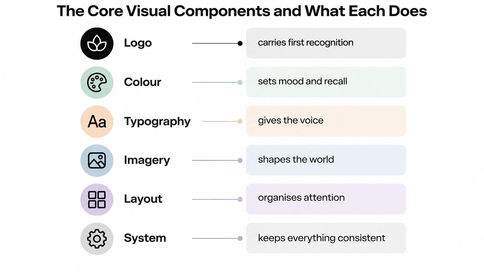
Component | Job it does | Where readers meet it | Common failure |
|---|---|---|---|
Logo | Creates first recognition | Website header, packaging, social avatars | Designed as a lone mark that fails at favicon size |
Colour palette | Sets mood and quick recall | Every surface, button and banner | Brand hues fail contrast on small text |
Typography | Carries voice and hierarchy | Headlines, body copy, email and print | Too many weights, or a display face used for body copy |
Imagery and art direction | Shows emotional tone and product credibility | Campaigns, product photography, social posts | Stock imagery that clashes with the palette |
Graphic elements and iconography | Provides navigation cues and brand motifs | Icons, patterns, dividers, interface states | Ornaments added without rules for use |
Layout and spacing system | Keeps formats consistent | Web grids, email templates, print layouts | No shared grid, so each channel drifts |
The concrete build matters more than the list. A logo needs a primary lockup, a reversed version for dark surfaces and a one-colour mark, each with defined clear space and a minimum size. A palette needs three to six colours with HEX, RGB and CMYK or Pantone references, plus neutrals reserved for text. Type means one or two families with named weights for headlines, subheads and body, and imagery means a written direction covering lighting, colour grading and subject rules. Icons and dividers get usage rules. The grid gets margins and spacing tokens.
The hierarchy, from fastest to slowest
The logo and palette do the fastest work at a glance. Someone recognises the coral rectangle in a wallet or the green serif in a feed before reading anything. Type and layout govern how long they stay and whether they can find the price, the size guide or the returns link. Get the fast layer wrong and nobody reaches the slow layer.
A five-second test for any asset
Cover the logo on a product page, an email header or a campaign tile. Ask whether the page still feels recognisably like the brand. If the answer depends entirely on the mark, the system is thin, and the fix is rarely a new logo. It's usually a tighter type hierarchy, a stricter colour role and a shared grid. The same discipline shows up in good email design inspiration, where a template holds its identity with images blocked.
How the Components Work Together Across Touchpoints
Consistency doesn't mean identical visuals. It means the same relationships repeated at different scales: the same primary colour pairing, the same headline typeface, the same proportion of space.
Touchpoint | Components doing most of the work | Rule that keeps it consistent |
|---|---|---|
Website and product pages | Logo, palette, typography, layout grid | One heading hierarchy from header to checkout |
Email and CRM | Colour, type, button styles | Brand colours tested for contrast, with a plain-text fallback |
Packaging and product labels | Logo, colour, iconography | Regulatory text and disposal information stay legible |
Social and paid campaigns | Imagery, palette, graphic motifs | Art direction still reads at thumbnail size |
Print and documents | Typography, layout grid, logo | PDFs and templates meet the same accessibility rules |
Imagery deserves the same rule-setting as the logo, because customers increasingly search by picture. In 2025, 71% of UK customers said they would use images rather than words to find products, according to the 4imprint UK From Scroll to Store report. If five photographers and three freelancers each interpret the brand, that 71% meets five different brands.
The adaptation principle is straightforward. Split the system into what must never change and what may flex. Never change: the mark, the primary colour, the type pairing. May flex: imagery treatment, secondary colours, layout density by channel. A logo shrinks to a favicon or reduces to one colour. A palette shifts to tints on a dark hero. Type steps down on mobile. The relationships hold.
Take a fashion label: a packaging sleeve, a product page and a welcome email share one headline typeface and one accent colour. The sleeve is dense with regulatory and material information. The product page is airy and image-led. The email is a single column with one button. Three densities, one identity. A well-built ecommerce web design keeps that hierarchy intact through the checkout, which is the point where most identities fall apart.
Colour and Type Rules That Pass Accessibility Checks
Approving colours as swatches is not approving colours. A palette that looks distinctive in a brand deck can fail the moment it lands on small CRM text, navigation links, form states or a campaign overlay.
The numbers are not negotiable. UK Government guidance sets a minimum contrast ratio of 4.5:1 for standard text and 3:1 for large text, icons and other non-text interface elements, measured on a scale from 1:1 to 21:1 where black on white sits at the maximum, as set out in the Home Office accessibility guidance on colour and contrast.
Element | Minimum contrast | Rule for the identity system |
|---|---|---|
Body text under 18pt | 4.5:1 | Applies to CRM copy, product descriptions and form labels |
Large text (18pt regular or 14pt bold and above) | 3:1 | Applies to headlines and display type |
Icons, input borders and focus indicators | 3:1 | Document each non-text element as its own token |
Error and status colours | 4.5:1 for text, plus a text or icon cue | Colour must never be the only carrier of meaning |
Logotypes | No minimum | Exempt when part of a logo; still test the wordmark on its background |
Why a swatch passes and a button fails
The failure pattern is well documented. Between January 2022 and September 2024, contrast failures made up 13.0% of recorded accessibility issues on monitored UK public-sector websites and mobile apps, second only to focus visibility at 13.3%, according to the UK Government accessibility monitoring report. Contrast is not an edge case. It's the second most common thing that goes wrong.
The cause is structural. A headline palette passes at 32 pixels and fails at 13. A button colour passes on white and fails on a photograph or a gradient. The identity didn't change; the surface did.
The legal frame for public sector work
For UK public-sector sites and apps, accessibility is a legal requirement rather than a preference. The Public Sector Bodies (Websites and Mobile Applications) (No. 2) Accessibility Regulations 2018 came into force for websites on 23 September 2018 and for mobile applications on 23 June 2021, requiring covered services to be perceivable, operable, understandable and accessible, to meet WCAG Level AA and to publish an accessibility statement with known issues and a contact route, per GOV.UK guidance on accessible websites and accessibility statements.
The scope reaches further than many expect. Intranet and extranet sites used by disabled employees, or by people working with the public sector, are covered, and downloadable PDFs and Word documents fall inside the standards. Department for Education implementation guidance requires WCAG 2.2 Level AA across its sites, apps and public documents, with documents published before 23 September 2018 due to be accessible by 23 September 2020, as the GOV.UK equality and accessibility requirements guidance sets out.
Monitoring has tightened too. Testing from October 2024 uses WCAG 2.2, which added six success criteria to WCAG 2.1, and identified issues may need fixing within 12 weeks, according to GOV.UK accessibility monitoring guidance.
Turning colour into rules
Document contrast-tested tokens for text, surfaces, borders, icons and links. Include hover, disabled and keyboard-focus states. Test every pairing at its intended size, against every approved background, including photography and gradients. Then add the rule that colour never carries meaning alone, so an error state pairs the red with words or an icon.
Practical rule: if a colour pairing needs a paragraph of explanation to justify it, it needs a second colour.
Run those checks during design-system construction and pre-delivery quality assurance, not after someone signs off the visual. A brand extension that looks correct in a static mock-up still changes after keyboard, screen-reader and structured-content testing.
How to Build an Identity System Step by Step
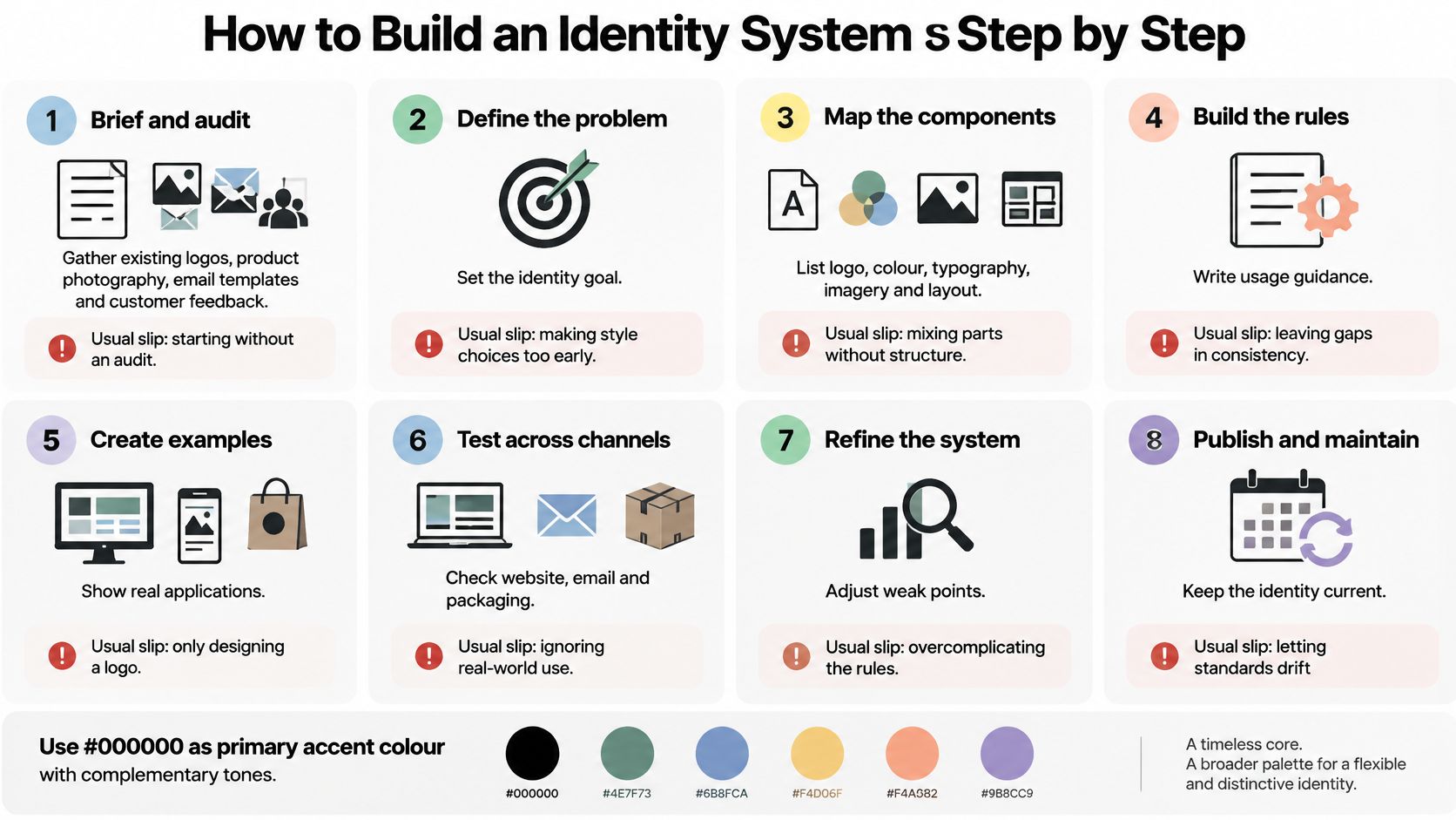
The sequence below is the one I use, and the order matters more than the duration.
Brief and audit. Gather existing logos, product photography, email templates, packaging and customer feedback, then write a short brief: the business, the goals, the design support needed, the budget and your preferred timing. That's enough to start. The usual slip is skipping the audit and redesigning what already works.
Define personality. Choose three to five adjectives and one sentence on what the brand is not. The slip is picking adjectives every competitor also claims, like premium and trusted.
Explore three directions. Each gets a mood board, a palette and a type pairing. Three real options beat one precious concept, and the comparison forces the strategy to the surface.
Develop and test the mark. Sketch, then test at favicon size, in one colour, and reversed on dark. The slip is approving a mark that only works at poster scale.
Build the palette and type scale. Pair each text colour with the background it will sit on and check contrast at the sizes used. A palette built in isolation produces tokens nobody can apply.
Apply to four real touchpoints. A website header, a product page, an email template and a packaging or social tile. The slip is stopping at the logo sheet and calling it a system.
Write the guidelines. Clear space, minimum sizes, misuse examples, imagery rules and design tokens. Include the failures, not just the successes, because the failures are what teams repeat.
Hand over and test. A shared Figma library, tokens exported for developers, and a review using live content rather than placeholder text.
Steps six to eight are where most projects fail. The identity looks complete in a presentation and then meets a real product page with 40 SKUs, five form states and a legal footer.
If you'd rather watch the process before working through it, that walkthrough covers the same ground visually.
Brand Examples From Beauty and Fashion Identities
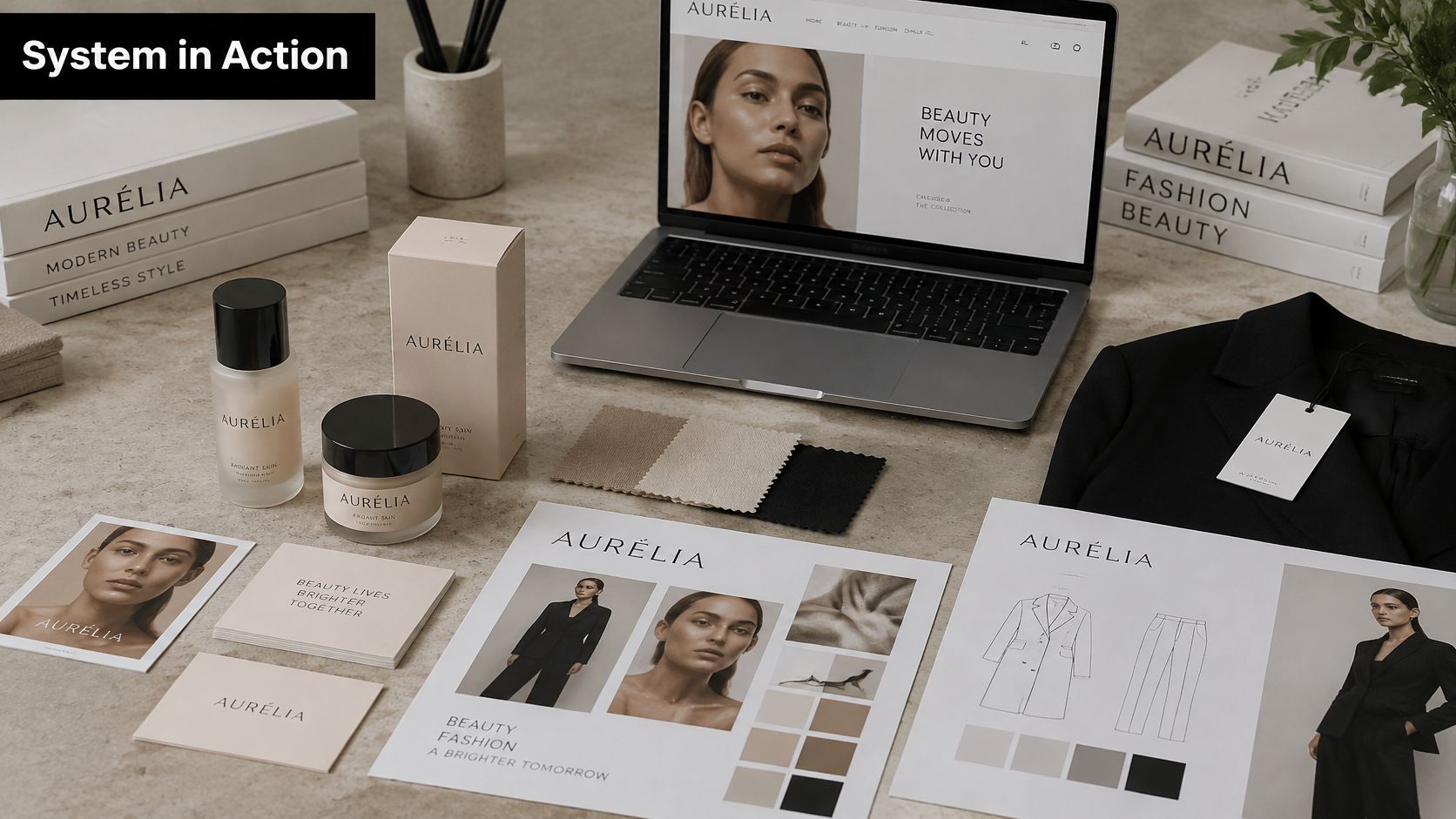
Three cases, two of them hypothetical, so the components read as a working system rather than a list.
A live beauty site
Steeve Elgui worked with L'Oréal on a new design element for its websites, delivered as a full redesign of a site area. Read that as one component change flowing through a live environment: the new element had to sit inside an existing palette, an existing type hierarchy and existing navigation. Nothing more should be assumed about the scope. What to check in your own brand: when one element changes, list every place it appears before the first pixel moves.
A fashion label with a contrast problem
Say a new label launches with a muted palette, a serif headline face and strong product photography. Three failures appear within a month. Product pages set body text in a light neutral that fails the 4.5:1 threshold. Packaging uses a foil the digital palette doesn't reflect, so the unboxing doesn't match the site. Email templates run stock imagery, breaking the art direction.
The fix is unglamorous: tokenise the text colours so body copy can't be set in the light neutral, restrict imagery to one written art direction, and proof packaging against the digital palette before print. What to check: pull your three lowest-contrast text styles and test them on the surfaces they appear on.
A technology brand with two button styles
A software brand's website and CRM emails used different button shapes, different corner radii and different fonts, because two teams built them a year apart. Moving both onto one shared component library removed the inconsistency in a single sprint, and every future page inherits the fix. What to check: screenshot a primary button from your site and from your last campaign email and put them side by side.
Keeping Trust When Your Identity Outruns Your Experience
Here's the question most identity guides avoid. What should a brand change visually after a service failure, a misleading claim or a reputational crisis?
The contrarian answer is that consistency alone isn't reassuring. Repeating a polished identity over an experience customers find unclear can sharpen scepticism rather than soften it. The gap between the promise and the delivery becomes the thing they notice.
UK evidence shows how narrow the recovery window is. 17% of UK consumers say they cannot be won back once they stop trusting a brand, 32% avoid brands they are unsure about, and 64% purchase more cautiously after trust has weakened, according to consumer trust research reported by the National Law Review. Nearly a fifth of your audience is gone for good, and two thirds are watching closely.
A new logo is not an apology. It's a change of clothes over the same behaviour, and customers read it that way.
Recovery work is visual but behavioural. Rebuild the information hierarchy so prices, policies and delivery times are findable in one click from any page. Rewrite claims in plain English you can substantiate. Acknowledge the mistake visibly rather than pushing a silent update. Then apply the corrected message in the same words across the website, the emails and the packaging, because mixed messages read as evasion.
Packaging is where this gets concrete for beauty and lifestyle brands. 65% of UK shoppers rank ease of recycling as the top packaging attribute, 34% switched brands in the previous year because of packaging concerns, and 62% say environmentally friendly packaging increases trust, per BIC sustainability research shared on LinkedIn. If your disposal icons and material labels don't match the environmental claim on the front of the pack, the identity has manufactured the exact scepticism it was trying to prevent.
Measure the recovery rather than the redesign. Track clarification requests to support, repeat purchase, unsubscribe rates and conversion at high-friction steps, before and after the change. Those four numbers judge identity work by behaviour, which is the only test that matters when trust has already been damaged once.
Choose In-House, a Freelancer or an Agency
Match the route to the job, not to the budget line.
Build in-house when a stable team already owns the logo, type and templates, and the work is maintenance, token updates or a single channel fix. You need continuity more than fresh thinking.
Brief a freelance designer when the need is a defined identity, an extension of an existing one, or a campaign with a deadline and a known set of touchpoints. The scope is clear enough to describe and small enough for one person to hold.
Use an agency when strategy research and positioning have to come before any visual work. Multi-market launches with research phases belong here, and so do organisations that need several disciplines moving at once.
Decide with five checks: internal capacity, new identity versus extension, how many channels must match, one-off versus ongoing work, and how fixed the date is. Two or more channels plus a fixed date usually points to a specialist freelancer rather than a generalist. A London senior freelance practice such as Steeve Elgui, with 12 years across UX/UI, branding and CRM email and work both directly with brands and alongside agency teams, fits that second route once the scope is clear.
This week, write a single paragraph naming the business, the goal, the design support needed, the budget and your preferred timing, then book a discovery call to walk through it. For ongoing help, send an outline of the work, the expected volume and how often you need it, and availability gets confirmed along with whether it's the right fit. Timing follows the size of the brief, the materials already in hand and the number of review rounds.
If your identity looks consistent in a deck but drifts across the website, the emails and the packaging, that gap is fixable. Steeve Elgui is a London senior freelance designer offering UX/UI, branding, brand guidelines, art direction and CRM email design, so logos, colour, type and the channels they live in get built as one system rather than four separate projects. Start with a short brief covering your business, goals, the support you need, your budget and your timing, and visit Steeve Elgui to book a discovery call.
Comments