London Freelance Web Designer: Services, Scope and Briefs
You have a launch date, a Shopify theme you've half outgrown, a campaign calendar with three drops on it, and no in-house designer to pull the website, the emails and the paid assets into something that looks like one brand. So you start looking for a London freelance web designer, and the search returns a wall of portfolios that all look competent and none of which tell you what a project costs in your time, or what you need to send before anyone can answer a straight question about availability. The gap between a beautiful case study and a working engagement is scope. That's what this guide is about: what a senior freelance designer delivers, how to tell whether you're briefing the right one, and how accessibility and performance criteria belong in the brief long before the launch date gets fixed.
Table of Contents
What a London Freelance Web Designer Delivers - The handoff detail clients forget to ask about
Making Accessibility an Acceptance Criterion - The checks to write into the brief
Experience That Signals Reliable Delivery - What to actually check
How Scope and Timelines Are Agreed - The phases a website project moves through - Why the launch date goes on the table first
Why London Brands Hire a Freelance Web Designer
A London marketing lead gets three separate requests at once: a landing page, a welcome email redesign and paid-social assets that all need to look like the same brand. The agency can cover it, but the proposal carries account time and multiple handoffs. A permanent hire gives continuity, although the current workload may not sustain one. Hiring a freelance web designer is a scoping decision.
A senior freelancer can take responsibility for UX/UI, visual identity, CRM email design and digital campaign delivery in a single engagement. Those deliverables are easier to align when one person understands the site journey, the brand system and the assets customers see after they click. Splitting them across suppliers makes the client do the alignment work instead.
I'm Steeve Elgui, a senior freelance designer based in London, working across UX/UI, branding, CRM email design and digital campaigns for brands and agencies.

The useful question is whether a designer can turn a rough need into a defined scope on the first call. That call should settle the audience, existing materials, review process, preferred timing and an indication of budget. If accessibility or performance matter, state what has to pass acceptance rather than treating either as a final tidy-up. Then availability and pricing can be discussed against defined requirements instead of a vague launch date.
What a London Freelance Web Designer Delivers
Four service areas, often bought separately and better bought together. Here's the whole picture before the detail.
Service area | What you receive | Typical use case | Common tools |
|---|---|---|---|
UX/UI design | Wireframes, journey mapping, design systems, brand integration | Website redesign, ecommerce experience, landing pages | Figma, Miro, Hotjar, Shopify, HubSpot, Wix |
Branding | Logo, colour palette, typography, guidelines, art direction, packaging and print | New identity, rebrand, extending an identity across materials | Figma, Illustrator, InDesign |
CRM and email design | Responsive templates, deliverability checks, campaign planning, A/B testing | Launch emails, retention flows, seasonal campaigns | Klaviyo, Mailchimp, Figma |
Digital campaigns | Campaign concept, art direction, multi-format adaptations, final assets | Product launches, seasonal pushes, paid and organic rollout | Figma, Midjourney, Firefly |
UX/UI design starts with the journey, not the pixels. In practice that means mapping how someone moves from a paid social click to a product page to checkout, then building wireframes for the pages that carry that journey, then turning them into a design system with named components, states and spacing rules. Miro for the mapping sessions, Hotjar for watching what real visitors do, Figma for everything that ships. If you want the deeper walkthrough of how that process runs, the freelance UX designer process covers it stage by stage.
Branding either establishes an identity or extends an existing one. New work covers logo, colour palette, typography, guidelines and art direction. Extension work is often the harder and more valuable job: taking an identity that lives comfortably in print and making it hold up on a 375px screen, in a Klaviyo template, and in a six-second story ad.
CRM and email design is where most ecommerce brands leak revenue. Responsive layouts that survive Outlook, deliverability hygiene so the domain doesn't land in spam, campaign planning and A/B testing on subject lines and layouts. Klaviyo and Mailchimp do the sending, Figma does the design.
Digital campaigns covers concept, art direction, multi-format adaptation and final delivery. One hero idea becomes a landing page, three paid formats, four social crops, an email header and a storyboard. AI-assisted image generation shortens the concepting loop; a human still curates what goes out.
The handoff detail clients forget to ask about
Performance is a design decision, not a developer afterthought. A 2022 benchmark of leading UK ecommerce websites, reported by Ryte, found 93.75% of mobile sites scored "poor" against Google's Core Web Vitals, with 0% reaching the "good" threshold; on desktop, 5.36% reached good and 33.93% still classified as poor.
Those measured dimensions map straight onto choices made in Figma. Oversized hero imagery and heavy font payloads inflate Largest Contentful Paint. Piles of third-party scripts delay First Input Delay. Unsized images and injected promo banners cause Cumulative Layout Shift. So the workflow specifies performance budgets alongside the visual deliverables: reserved image dimensions, responsive variants at named breakpoints, a cap on above-the-fold asset weight, deferred non-critical scripts, loading states drawn as real components, and throttled mobile testing on representative pages before handoff.
Practical rule: if a deliverable doesn't include the image dimensions and the loading state, the developer will invent both, and the mobile experience will be worse than the design.
Before the first call, tick which rows of that table your project needs. Most briefs require two. A launch usually requires three.
Making Accessibility an Acceptance Criterion
Accessibility gets treated as a compliance tax and applied at the end, which is why it so often fails. The better frame is that it's an engineering acceptance criterion: a condition a deliverable must meet before it's signed off, exactly like a working checkout or a page that loads in under three seconds.
The UK Government's monitoring of 1,203 public-sector websites and 21 mobile apps found 29,787 accessibility issues against WCAG 2.1 Levels A and AA, of which 55.3% were fixed during remediation and 12.4% remained unresolved at retest, according to the accessibility monitoring report. The recurring failures were focus visibility (12% of issues), accessible names, roles and values (11%), colour contrast (11%) and semantic structure (9%), followed by link purpose, keyboard operation and text resizing at 8% each.
Read that distribution carefully, because it kills the common assumption that accessibility is a colour problem. Contrast accounts for about a tenth of it. The rest lives in interaction, semantics and content.
Retail is weaker. Adobe's analysis of the 100 most popular UK retail brands, published in the Design Index, found 84% of homepages contained critical accessibility issues, and every homepage tested had at least one WCAG 2.1 AA violation.
The checks to write into the brief
Palette contrast, tested at palette stage: brand colours get checked against text and background pairs before the identity is signed off, not after the site is built.
Visible focus styles, designed into the identity: focus rings are a brand element, not a browser default you override.
Type that survives resizing: layouts reflow without losing content or function when text scales.
Semantic headings and labelled controls in the handoff: heading hierarchy and form labels specified for the developer, not left to guesswork.
Keyboard-complete product filtering: filters, sort menus and quick-add all operable without a mouse.
Alt text written into campaign assets: every exported image ships with its description, including email imagery.
Logical reading order in email templates: the order a screen reader announces things matches the order a sighted reader sees.
Done this way, accessibility tends to improve hierarchy, forms and navigation clarity rather than flattening the design. Luxury brands worry it will make the work look generic; in practice the constraints force better typographic and contrast decisions. The first call should establish who signs off accessibility at review, because if nobody owns it, it slips.
Experience That Signals Reliable Delivery
Every freelancer claims to be senior. The vetting question is narrower: have they shipped work in your sector, and have they shipped it inside a team like yours?
Sector fluency means different things. Beauty and fashion demand editorial art direction and campaign consistency, so a designer who can art-direct a product shoot and then translate it into four paid formats is worth more than one with prettier case studies. Technology brands need product logic and design systems. Ecommerce adds conversion-focused journeys on top of both.
What to actually check
Named client work with live URLs. You can open the site and judge it in thirty seconds.
Agency collaborations. It tells you whether they've worked inside approval chains and established guidelines.
Recommendations that mention specifics. Responsiveness matters more than "great to work with".
Sector overlap, not sector identity. Adjacent experience transfers better than it looks on paper.
Applied to this practice: twelve years across UX/UI, branding and CRM email design, with selected work for Jimmy Choo, L'Oréal, Amazon, Busuu, Max Factor and Nespresso, plus agency experience at Ogilvy, Havas, Hogarth and Closer. That agency background is the part clients underestimate, because it means slotting into an existing creative team, working to someone else's brand guidelines and surviving a multi-stage approval chain isn't an adjustment.
Andrew, a former collaborator: "He very quickly understood the brand and its values, which helped him adapt swiftly to the brief and its aims."
The traits that recur in collaborator feedback, fast comprehension of brand values, organised project management, responsiveness and delivery against agreed deadlines, are exactly the ones that de-risk a freelance engagement. Portfolio gloss predicts taste. Those traits predict whether the thing lands on time.
So shortlist designers who've shipped in your sector and inside a team shaped like yours, then ask for one reference from a comparable project. Not three references from your easiest work. One from the project that was most like yours.
How Scope and Timelines Are Agreed
Cost and schedule both follow scope, so the first call exists to agree what is being bought. The quote comes after.
Engagement type | Typical scope | Indicative timeline | What extends it |
|---|---|---|---|
UX/UI audit and quick wins | Journey mapping, heuristic review, prioritised recommendations, wireframes for key pages | 2-3 weeks | Delayed access to analytics, site and brand assets |
Website design project | Wireframes, visual design, design system, developer handoff | 4-8 weeks | Template count, review rounds, unready content |
Brand identity project | Logo, palette, typography, guidelines, rollout assets | 3-6 weeks | Packaging and print production schedules |
Campaign or launch support | Concept, landing page, email templates, multi-format adaptations | 2-4 weeks | Format count, media and print deadlines |
Ongoing design support | Retained capacity against an agreed outline and volume | Rolling monthly | Forecasting accuracy and approval speed |
Those ranges assume two things clients forget to promise: prompt consolidated feedback and ready materials. Miss either and the range stops meaning anything.
The phases a website project moves through
A website design project runs through a fixed sequence. Brief and scope call to agree what is in, what is out and who signs off. Journey mapping to establish the paths that matter, usually three to five of them. Wireframes for the key templates, reviewed before any visual work. Visual design applying the identity across those templates. Design system and handoff, where components, states, spacing and image specs get documented for the developer.
Review rounds sit at each milestone, and the number of them belongs in the scope document. Two rounds per stage is workable. I would treat "unlimited revisions" as a scope risk rather than a selling point, because it gives the project no finish line and everyone discovers that late.
The scope call also settles acceptance criteria: the accessibility standard the finished templates are tested against, the performance targets the design has to respect, and which materials the client supplies. Fixing those before a launch date is agreed stops them resurfacing mid-build as a dispute about what was included.
What genuinely extends a timeline: conflicting feedback from two stakeholders, extra review rounds, unready product imagery, and platform constraints in Shopify, HubSpot or Wix that force a different structural approach mid-build.
Why the launch date goes on the table first
Retail demand moves quickly, so a date picked in isolation often proves optimistic. The ONS retail sales bulletin for October 2025 reported online sales values down 0.8% month on month, though they stayed 4.8% above October 2024. A channel that swings like that punishes a schedule with no slack in it.
A designer can't judge whether your requested scope is realistic without knowing your intended launch window, campaign date and review deadlines. Those three facts change the answer to "can this be done by then" more than the page count does.
The contrarian point on scope: a tightly scoped programme, journey fixes on the pages that convert, reusable components, a set of email templates and documented brand rules, frequently beats a dramatic rebuild. It ships sooner, it is easier to measure, and it does not bet the quarter on a single launch.
Ongoing support runs on the same logic. A client sends an outline of the work, the expected volume and how often help is needed, and availability and fit get confirmed against that rather than against a vague retainer promise.
Price follows the same drivers as the timeline: page and template count, review rounds, asset count across formats, and platform constraints. Project cost depends on the scope, deliverables and level of involvement required, so pricing is discussed once a short project outline, preferred timing and an indication of budget are on the table. If you are preparing one, the website redesign proposal structure shows what a useful outline contains.
Typical London Projects and How They Run
Two archetypes cover most of the work, and they run differently enough to be worth separating.
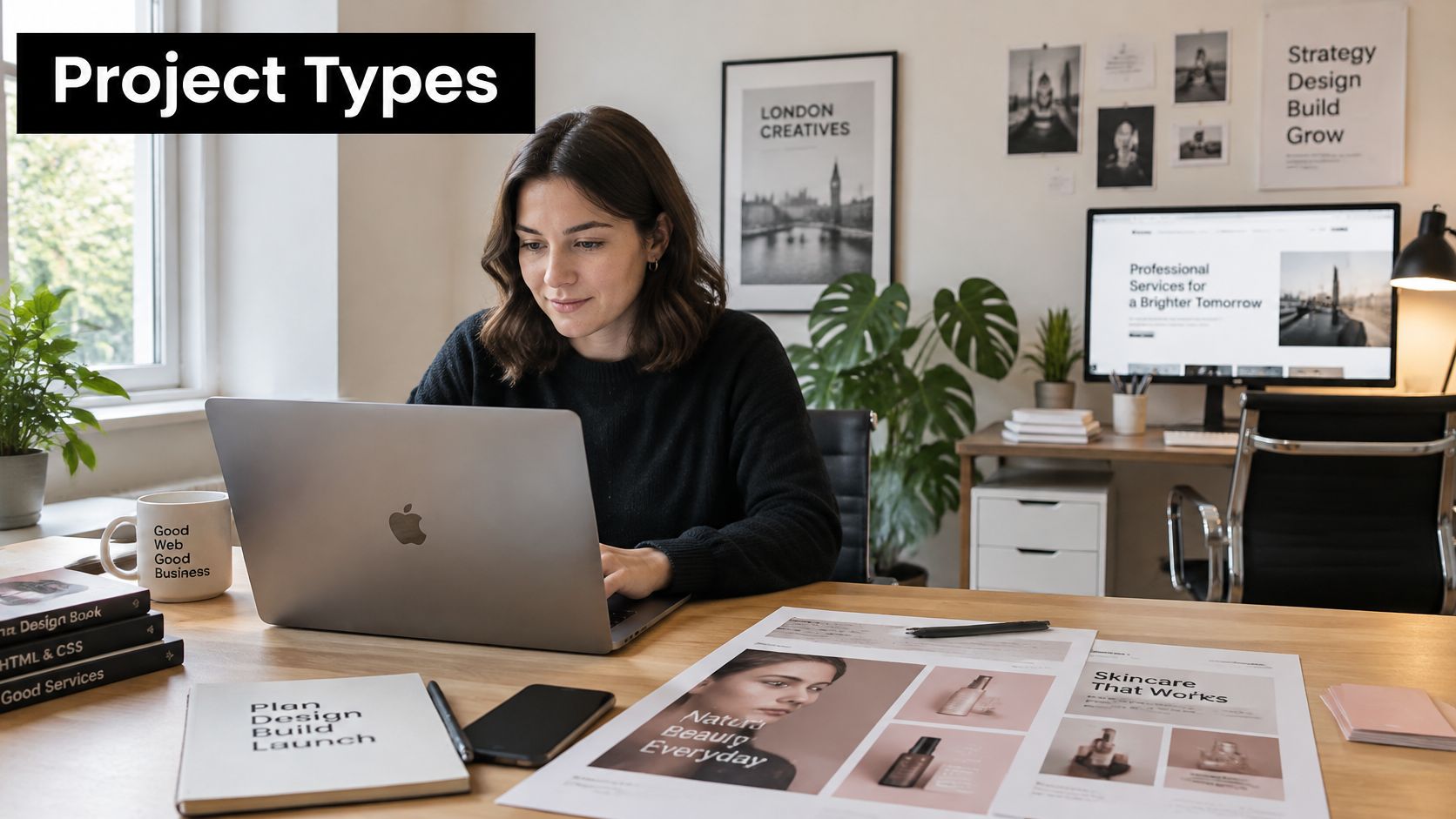
The first is a beauty or fashion ecommerce launch. A serum or a capsule collection has a date, and the date needs a landing page, a homepage refresh, an applied identity across all touchpoints, three CRM emails in Klaviyo or Mailchimp, and campaign adaptations for paid and organic. Running that from one design system is the whole advantage: the type scale, the button states and the image treatment are already decided, so the tenth asset takes an hour rather than a day. The blend of UX/UI and CRM execution is the same combination that shows up in a full redesign of a site area for L'Oréal and in multiple trade-driving emails built for Waitrose & Partners.
Then there's the commercial reason it matters. Online sales represented 28.0% of total retail sales in Great Britain in September 2025, up from 27.8% in August, and online spending values rose 5.0% in Q3 2025 against the same quarter in 2024, per the ONS retail sales bulletin for September 2025. The website, the email and the campaign layer isn't decoration on top of the business. It's a revenue channel that carries more than a quarter of retail.
The second archetype is a technology brand launch or rebrand. Identity, website experience, design system and launch assets, often with campaign formats extending into motion and social. That's a broader brief, and it benefits from a designer comfortable crossing from interface into art direction. Work like the corporate video produced for Amazon sits at that end of the range.
The pattern worth remembering from both: when one designer holds the journey, the identity, the email and the campaign together, the brand presents consistently and the launch timeline shortens. Not because the designer is faster than three specialists, but because nobody spends a week reconciling three interpretations of the same brand.
Send a Short Brief and Check Availability
A senior London freelance web designer fits a launch, a rebrand, a conversion-focused improvement programme, or extra capacity alongside an in-house team. If the work needs media buying, PR and a large multi-discipline retainer, an agency is the better call, and a good freelancer will say so rather than take the work.
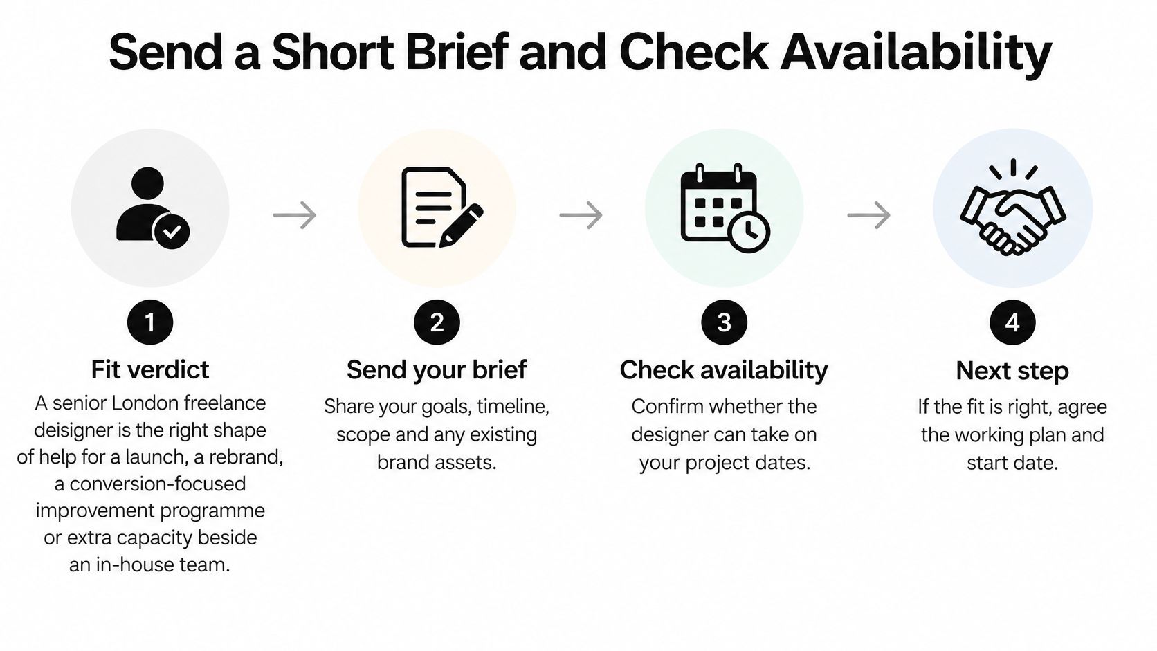
The brief that gets a useful answer is short. An afternoon is enough to write it. Send these seven things in one message.
The business. Sector, audience, what you sell and who buys it.
The goal. A launch, a rebrand, a conversion improvement or campaign support. Be specific about which.
The design support needed. Which of website, identity, email and campaign are in scope, and which are not.
A budget indication. A range is fine and far better than silence, because it determines whether the scope conversation is realistic. Pricing is worked out against scope, deliverables and the level of involvement required, so this number shapes the first serious answer you get.
Timing. A preferred launch date, a campaign date, and any hard review deadlines.
Links and materials. Your existing website plus brand guidelines, asset libraries or design files the designer can review before the call.
Who signs off. The person who approves, and whether anyone else can veto.
Two additions belong in that message before a launch date is fixed: the accessibility standard the site has to meet and the performance expectations for key pages. Stated now, they become acceptance criteria. Left out, they surface in the final week as rework.
On the first call the designer should demonstrate quickly that they understand your brand and sector, confirm availability against your dates, and give an honest first view on scope. That call is also where you agree how the engagement runs: how often work is reviewed, who sits in on sign-off, and what happens when the brief changes mid-project.
The question that saves the most time: "what would you cut if this had to launch three weeks earlier?" A good designer answers immediately. A vague one tells you everything you need to know.
Ongoing support runs on a different brief. Send an outline of the work, the expected volume and how often you need help. Availability and fit get confirmed against that, and it predicts the working relationship better than a single project quote.
If you're writing the brief today, the website design brief template breaks down each section so you can fill it in without second-guessing the format. Attach the links, state the date and the budget range, and send it. The first call then settles something concrete instead of admiring a portfolio.
Steeve Elgui is a senior freelance designer in London working across UX/UI, branding, CRM email design and digital campaigns, with twelve years of experience and projects for brands including Jimmy Choo, L'Oréal, Amazon and Max Factor. If you're planning a launch, a rebrand or an ecommerce improvement programme and want an honest first view on scope and timing, send a short brief with your goals, budget indication and preferred dates. Visit Steeve Elgui to check availability and start the conversation.
Comments