Freelance UX Designer: Role, Deliverables and Scope
The brief lands on a Tuesday: four lines, a link to the live site, and the phrase "we're thinking a refresh". Nobody says who approves the work. Nobody has shared analytics access. The deadline is fixed, the budget is a range, and the person who wrote the brief may not be the person who signs it off.
Three answers settle most of that ambiguity before a single frame is drawn. Who signs off, and after how many rounds? Which journey carries the money? And what counts as finished, in files a developer can build from?
Get those and hiring a freelance UX designer becomes a clean commercial arrangement: senior judgement applied to a defined problem for a defined period. Skip them and the project drifts into unpaid revisions while everyone waits for a decision nobody owns.
Table of Contents
UX/UI Deliverables You Should Expect at Each Stage - The Deliverables That Quietly Disappear
Building Accessibility Into Brand-Led Interfaces - The Handover Checklist That Travels With the Brand
How to Judge Fit and Scope a Freelance UX Project - Three Ways the Work Arrives - Why a Single Journey Is a Serious Brief - What a First Brief Should Contain
What a Freelance UX Designer Does and Why It Matters
Walk a delivery route before the road is built and you learn what no map shows. Where the pavement narrows. Where the crossing lights take too long. Where people cut across the grass because the official path sits in the wrong place. A UX designer does that with a digital journey: traces the route a customer takes, finds where they stop, get lost or give up, and changes the path before development pours the concrete.
UX covers the research, the journey structure, the information flow and the testing that proves the route works. UI is the visible layer on top of it: screens, components and the interaction states that make a system feel predictable.
The image below shows the ordinary starting point, someone walking a route with a notebook, watching what happens rather than what the process diagram claims.

The freelance part is a delivery model. A senior designer takes defined assignments directly from brands, through agencies, or embedded inside an in-house team for a set period. It suits UK design well: the Design Council's design economy research found that 22.3% of self-employed designers described freelance work as their source of income, against 13.8% of all self-employed workers.
A UX designer decides whether a customer can do what they came to do. Layout, type and colour support that decision. They don't replace it.
The value is judgement without a permanent salary: a site section, a checkout fix, a campaign deadline. The role is not a substitute for development, a full research programme or brand strategy, unless the brief explicitly asks for one of those.
UX/UI Deliverables You Should Expect at Each Stage
A healthy freelance UX project shows its working. Every output below should exist in some form before a developer builds anything, even if the artefact is three annotated frames rather than a 60-page document. Use the table as a checklist against whatever proposal lands in your inbox.
Deliverable | What It Answers | Typical Format | Project Stage |
|---|---|---|---|
Stakeholder brief and goals | Goals, constraints and who signs off | Written brief and Miro board | Discovery |
Journey map | Where the customer hesitates or leaves | Miro journey map | Discovery |
Analytics and session review summary | Which steps show friction in real behaviour | Hotjar heatmaps, recordings and funnel notes | Discovery |
Prioritised problem list | Which fixes matter most | Ranked document linked to the journey map | Discovery |
Low-fidelity wireframes | Structure, flow and content order | Figma frames | Concept |
Usability test plan and findings | Whether the flow works for real users | Test script and annotated recordings | Validation |
High-fidelity UI screens | Visual hierarchy and brand expression | Figma screens | Design |
Component library and design tokens | Consistency across pages and channels | Figma components and styles | Design |
Interaction and state specifications | Behaviour in hover, focus, error, disabled and empty states | Annotated Figma frames | Handover |
Accessibility acceptance notes | Keyboard operation, contrast and focus visibility | Checklist with acceptance criteria | Handover |
Responsive layouts | Behaviour at mobile and desktop widths | Figma breakpoints | Design |
The Deliverables That Quietly Disappear
Three items go missing most often, and each one costs more downstream than it would have cost to produce.
The prioritised problem list. Without it, every stakeholder's favourite fix competes equally, and the redesign becomes a collection of opinions. Ranking problems against the journey map settles arguments before they start.
State specifications. Default desktop screens get signed off, then developers invent hover, error, disabled and empty states. Those inventions are where inconsistency enters a design system and never leaves.
Accessibility acceptance notes. A contrast decision without a documented ratio is a preference. A checklist with acceptance criteria is something a developer can fail.
A focused review of a single journey may skip the full component library, and that's fine. It should still ship the problem list, the test findings and redesigned key screens.
The handover test: if a deliverable can't be named when files change hands, it was never in scope. Write the list into the brief, not the invoice.
How a Freelance UX Project Unfolds Week by Week
The order of work matters more than the speed of it. Each step here exists to stop the next one from being guesswork.
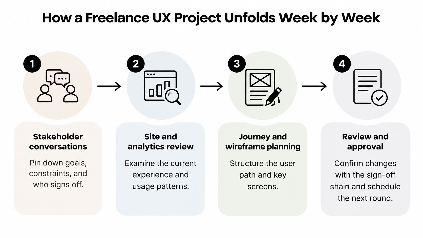
Stakeholder conversations first. Pin down goals, constraints and the sign-off chain, because that chain decides how many review rounds are realistic and who has to be in the room at each one.
Review the site and whatever data exists. The UK Government Service Manual's discovery guidance lists interviews, observation, existing analytics, back-office workflow and support logs as evidence sources, and expects a map of the current experience with documented barriers as the output. That's the standard to hold a brief to.
Map the priority journey in Miro. Draw entry point to outcome, mark every hesitation, and agree the problem in one shared view so marketing, operations and customer service stop describing different sites.
Get to low-fidelity wireframes before the week ends. Something concrete in Figma turns a conversation about opinions into a conversation about a screen.
Test the flow in weeks two and three. The same manual's planning guidance for user research says teams usually need between 4 and 8 participants per round, and recommends measuring task-completion rates and time-on-task across journeys rather than trusting enthusiasm in a workshop.
Move into high-fidelity screens and component specifications. States, tokens and accessibility notes belong here, while the layout is still cheap to change.
Hand over files, annotated states and acceptance criteria. A developer who has to interpret a static screen will interpret it differently from the designer who drew it.
Where timelines slip, the cause is rarely design. It's late sign-off from someone who joined the review in week three, analytics access granted after the audit was due to start, or goals that were never agreed because nobody wanted to say them out loud.
The walkthrough below follows the same sequence from research through to a testable design.
Diagnosing a UX Problem with the Right Tools
Each tool answers a different question, and mixing them up is how projects end up redesigning something that was never broken.
Hotjar answers what people do. Recordings and heatmaps show hesitation, repeated taps, rage clicks and the exact step where a session dies. Use them to locate the step worth investigating, not to explain it.
Miro answers where the organisation disagrees. The journey map is where analytics, operations and customer service put their version of the same journey side by side. When the data contradicts the internal story, that gap is the finding.
Figma answers what to try. Wireframes test a hypothesis cheaply; the full UI and design system come after the hypothesis survives.
Consider a beauty brand whose mobile checkout loses people at the delivery step. Hotjar shows sessions returning to that section more than once before exiting. Miro maps the delivery question across marketing, operations, and customer service, revealing that the promised delivery window differs in three places. Figma then tests two versions that surface cost and timing earlier, and only one of them needs building.
What none of the tools do is prove intent. A heatmap shows a pattern, not a reason, and a polished redesign that never targets a measured barrier is an expensive guess with good typography. My working rule is simple: name the barrier in one sentence before opening Figma. If the sentence needs a paragraph, the diagnosis isn't finished. The same discipline applies when you plan a website redesign around evidence rather than around a new mood board.
Before you design anything: write the barrier as one sentence a stakeholder could repeat in a meeting. "People abandon at delivery because cost appears after they've entered their address."
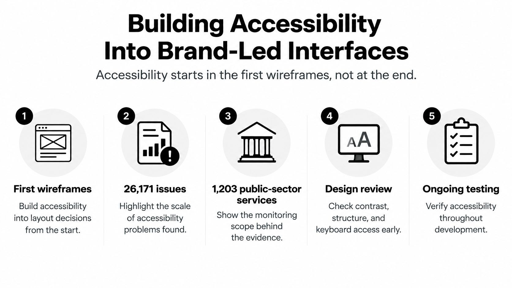
Building Accessibility Into Brand-Led Interfaces
Accessibility gets decided in the first wireframes. A compliance pass bolted on before launch means rebuilding screens that were never designed to pass, and the scale of what gets missed is measurable. UK government monitoring of 1,203 public-sector websites and 21 mobile apps identified 26,171 accessibility issues, with the most common criteria being Focus Visible at 13.3%, minimum contrast at 13.0%, keyboard operation at 10.8% and reflow at 9.2%, according to the accessibility monitoring report for public sector sites. Focus and contrast sit at the top of the list, which means the failures are concentrated in the decisions a designer controls earliest.
Ecommerce carries the same risk with more commercial exposure. A scan of 115 UK ecommerce sites found that 97.4% had at least one critical or serious accessibility issue, averaging 38.4 issues per site, with colour-contrast problems on 73.9% of sites and missing or unclear link text on 72.2%, as reported in the State of UK Ecommerce Accessibility report.
That evidence challenges a common assumption: that premium brand expression and accessibility pull against each other. They only conflict when brand rules are treated as immutable. A luxury palette with pale type on white is a contrast decision nobody made. Keep the signature colour and define accessible text and button tokens from it. Test display typography against contrast ratios before approval rather than after build, and treat the sign-off as part of the deliverable: someone named approves the tokens, and that approval travels with the system into every template that inherits it.
The Handover Checklist That Travels With the Brand
A brand system that survives contact with ecommerce, CRM email and Shopify components needs its accessibility decisions written down in the same place as its colour rules, and brand identity guidelines are the natural home for them. The checklist is scoped by outcome, each line naming what must be true at handover rather than how many screens were reviewed.
States documented: focus, hover, error, disabled and keyboard states drawn in Figma, covering every component a developer will build, not just the default desktop view.
Contrast checked per token: every text and button colour pair verified, including light typography used for editorial moments.
Reflow specified: behaviour at narrow widths agreed for image-led navigation and dense product grids.
Link text reviewed: checked out of context, so a screen reader user hears a destination rather than "click here".
Manual testing assigned: a named person responsible for testing keyboard order, visible focus and checkout error recovery before release.
The checklist stays live in the design system and gets re-run as pages, templates and campaigns are added. Each new asset inherits the approved tokens, and each release confirms them again, because an accessible design system is only as good as the last thing built from it.
How AI Changes Freelance UX Scope and Pricing
The question clients ask is whether AI will replace UX designers. The useful answer is about which work it changes, and what a senior freelancer should therefore price.
Routine production is being repriced. Reporting on Upwork workforce data, Prolific North notes that contracts for generative-AI and creative production rose 90% year on year while average earnings per contract fell 13%. More complex work combining AI with professional expertise grew 72%, with earnings up 22%. UK entry-level hiring fell across 30 of 38 tracked occupations, including a 28% year-on-year decline for graphic designers.
Read those three figures together and the shape of the market becomes clear. Variant screens, resized assets and first-draft copy are commoditising. Judgement about journeys, accessibility and test design is gaining value, because someone still has to decide what to build and prove that it works.
Scope hybrid delivery accordingly. Name which deliverables are AI-assisted and which need human review, state who checks outputs for accessibility and brand fit before handover, and keep approval for customer-facing decisions with a named person. A generated image that fails contrast or misrepresents a product is a defect, not a shortcut.
Pricing follows the outcome and the expertise required, not the number of screens generated. A checkout decision, an accessibility acceptance set or a component specification that developers can build from is worth more than forty variants nobody tested, whatever tool produced them.
Clients aren't buying pixels. They're buying a decision they can defend to their finance director and their customers.
How to Judge Fit and Scope a Freelance UX Project
Design demand sits across sectors rather than inside one creative niche. The Design Council's analysis of the design economy put UK design economy gross value added at £97.4 billion in 2019, or 4.9% of total UK GVA, with 1.97 million people employed in 2020. That breadth matters when you scope, because the same journey-mapping and wireframing skills serve a beauty brand, a retailer, a fintech onboarding flow or an agency's client deadline.
Three Ways the Work Arrives
A brand commissions a defined piece. A site section, an onboarding flow, a campaign landing page. The deliverable is agreed up front and the brand owns the sign-off. Steeve Elgui worked with L'Oréal on a new design element for its websites, delivered as a full redesign of a site area. That is a defined project with a clear finish line, and it prices and schedules accordingly.
An agency adds senior capacity. Agencies bring in freelance UX/UI to cover client delivery without permanent hiring, often against a fixed deadline. Steeve Elgui has worked with agencies including Ogilvy, Havas, Hogarth and Closer, both inside established creative teams and as a designer on a specific brief. The Policy and Evidence Centre's skills audit of design and designer-fashion businesses explains why this pattern holds: 96% of those businesses have 0 to 9 employees, against 89% of all UK firms, and 53% of employers expected to increase staff numbers, including freelancers and agency staff, against 46% across the creative industries. Project work and freelance support are structural, not a stopgap.
An in-house team embeds a freelancer. When workload or a deadline exceeds permanent capacity, a designer joins the client's team for a set period and works inside its existing tools, files and component library. The work follows the client's process, and handover back to internal owners is part of the job, not an afterthought.
Engagement | Best When | Typical Scope | Watch For |
|---|---|---|---|
Single-journey review | One step loses most users, such as product page to checkout | Prioritised recommendations and redesigned key screens | Drifting into a full site redesign |
Defined project | A new site section, campaign page or identity extension is needed | Agreed deliverables and set review rounds | Undefined sign-off and shifting goals |
Embedded or ongoing support | Steady volume exceeds in-house capacity | Outline of work, expected volume and frequency, with availability confirmed first | Handover to internal owners and file access |
Agency client support | A client deadline needs senior UX/UI capacity | Specific deliverables within the agency's own process | Client confidentiality and the approval chain |
Why a Single Journey Is a Serious Brief
Narrow scope is focused scope. A Leeds Beckett University Retail Institute study of checkout abandonment reported that 74% of baskets created in the UK in the last quarter of 2024 did not result in a completed order, rising to 76% on mobile against 67% on computers. A focused review of the product page to checkout transition attacks the highest-loss step directly, with recommendations and redesigned key screens, and avoids the cost of a full site rebuild.
Judge a project by the decision it unblocks and the people who have to agree it. A scoped brief names the sign-off chain, the review rounds and what gets handed over: annotated files, a component specification, accessibility notes a developer can build from. If those acceptance points are undefined at the start, the scope is not finished, whatever the screen count says.
What a First Brief Should Contain
A short brief is enough to start a proper conversation. Cover the business and what it sells, the goals for this piece of work, the journey or screens involved, the design support you think you need, a budget indication and your preferred timing. If you are unsure how to frame it, this guide to writing a website design brief covers the essentials.
For ongoing support, send an outline of the work, the expected volume and how often you need help, and availability gets confirmed before anything is committed. That sequence protects both sides. You learn quickly whether the fit is real, and the designer confirms the scope rather than guessing at it.
If you're scoping a UX project and the brief is still half-formed, Steeve Elgui works directly with brands and alongside agencies on journey mapping, wireframes, design systems and CRM email design, with 12 years across beauty, fashion, lifestyle, technology and ecommerce. Send a short outline covering the business, the goals, the design support you need, a budget indication and your preferred timing, and you'll get a straight answer on fit and scope. Visit Steeve Elgui to start that conversation.
Comments