How to Structure a Website Redesign Proposal That Wins
The brief lands on a Tuesday. A beauty brand you've spoken to twice wants a website redesign proposal by Friday, and the email carries a launch date, a page list with three gaps in it, and no budget line anywhere.
You know the site. The checkout is miserable on a phone and the product pages bury delivery information below the fold. What you don't yet know is whether this client wants a document they can approve or a deck they can admire. Those are different jobs, and the proposal is where you pick one.
Table of Contents
The Five Parts Every Redesign Proposal Needs - Read it the way a client reads it
Turning Objectives Into Measurable Targets - Start from the baseline, not the wish list
Writing Scope and Deliverables as Acceptance Criteria - Three lists, not one - Accessibility as an acceptance test
Building a Realistic Schedule Around Review Points - What late feedback actually costs
Presenting the Budget Line by Line - Contingency needs a release trigger
The Five Parts Every Redesign Proposal Needs
Start with the number that makes the whole document commercial. The Office for National Statistics retail sales bulletin for November 2025 put online sales at 28.6% of total retail sales in Great Britain, up from 28.4% in October, with online sales values 8.3% higher than in November 2024. Online sales now account for over a quarter of UK retail, so a redesign is a decision about a channel that carries serious revenue. Write the proposal like it.
That share holds month after month, which makes it a planning assumption rather than a spike. The September 2025 bulletin recorded 28.0% of total retail sales online, with online spending values 5.0% above the third quarter of 2024. Quote the latest figure once, near the top, and move on. The client doesn't need a market essay. They need evidence that you understand what you're being asked to improve.
Part | Question it answers | What to include |
|---|---|---|
Objectives | Why are we redesigning, and how will we know it worked? | Business problem, baseline metrics, target outcomes |
Scope | What exactly is included and excluded? | Page and template list, user journeys, platforms, languages, integrations |
Deliverables | What will we receive and approve? | Wireframes, design system, responsive templates, accessibility report, handover files |
Schedule | When does each phase happen and where are the reviews? | Phase dates, review windows, dependencies, target launch date |
Budget | What does each part cost and what changes the price? | Cost lines by phase, assumptions, contingency, payment milestones |
Read it the way a client reads it
Objectives come first because everything downstream is a consequence of them. Scope comes second because scope is the sentence a client forwards to their finance director. Approval stalls when a proposal says "full site redesign" and never clarifies whether the 40 blog posts, the localised German pages or the wholesale portal are inside the work. Vague scope doesn't protect you. It moves the argument to week six.
Deliverables, schedule and budget then answer the three questions a client asks out loud. What do I get? When? What does it cost? Give each one a single question to answer and resist the temptation to merge them. A schedule that doubles as a deliverables list tells nobody where the review points sit.
Each part should end in something the client can check. A target metric they can accept or challenge. A page list they can tick off. A review date they can put in a calendar. A cost line they can query. Approval then becomes a series of small yes-or-no decisions spread across the document, and signing is the last one rather than a leap of faith at the end.
Put a short summary at the top before any of this. One sentence for the objective, one for the launch window, one for the total investment. Somebody will read only those three lines before forwarding the document to a colleague.
If a client can't say what's in and what's out after reading your first two parts, the document isn't ready to send. Fix scope, not the cover page.
Turning Objectives Into Measurable Targets
An objective without a starting number is a slogan. "Improve the user experience" cannot be assessed in six months, and neither can "increase conversion" if nobody knows what conversion was last November. The proposal has to show the current figure before it promises movement.
Pull the baseline from analytics you've seen, not from the client's memory of a dashboard. Take twelve months where possible, so seasonality doesn't turn a quiet January into a crisis. Segment by device and by acquisition channel, because a mobile checkout problem looks like a general traffic problem until you split the data.
Start from the baseline, not the wish list
The case for journey work rather than a visual refresh is easy to make in the UK, where product research happens online well before purchase. Ofcom's Online Nation 2025 report finds that 71% of UK online adults searched online for information related to a potential purchase. Comparison tables, specification copy, delivery detail and reviews aren't decoration. They're the content that carries the decision.
Metric | How to baseline it |
|---|---|
Conversion rate | Sessions to orders over the last 12 months, split by device |
Checkout completion | Checkout starts to confirmed orders, split by device |
Search use and success | Share of sessions using search and share of searches with no results |
Mobile task success | Share of moderated test tasks completed on a phone |
Revenue per visitor | Total revenue divided by sessions over the same period |
Email sign-up rate | CRM sign-ups divided by sessions, split by channel |
Write hypotheses before anyone opens Figma. Clearer comparison may lift add-to-cart rate. A shorter mobile navigation path may reduce abandonment. Tying site events to email segments, so a browse event feeds a specific Klaviyo or Mailchimp flow, may raise sign-up quality rather than volume. That last one is where the campaign work and the website stop being separate conversations, because the segment is only as good as the event you chose to track.
Name one protected metric in the proposal. Redesigns frequently improve discovery while damaging checkout, or speed up the homepage while slowing the product template. Agreeing in advance that checkout completion must not fall gives you a rule to act on when the numbers land, instead of a debate about whether the site "feels faster".
Write three to five objectives. Give each one metric and one named owner inside the client's team. An objective without an owner is a wish with a deadline attached.
Writing Scope and Deliverables as Acceptance Criteria
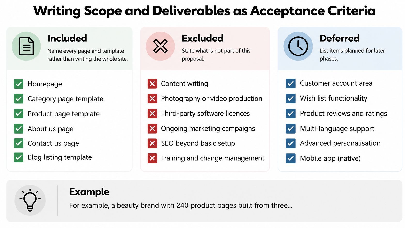
Say a beauty brand has 240 product pages built from three templates. That single detail changes the job from "redesign the site" to "redesign three templates and the pages that inherit them, with the editorial blog outside the work and the gift-card flow deferred". A client can approve that. Nobody can approve "the whole site".
The UK Government Digital Service accessibility monitoring programme shows why acceptance criteria beat reassurance. Across 1,203 public-sector websites and 21 mobile apps monitored from January 2022 to September 2024, it identified 29,787 WCAG 2.1 A/AA issues, most commonly visible keyboard focus (13.3%), insufficient contrast (13.0%) and keyboard operation (10.8%).
Three lists, not one
Included: every page, template and journey in the work, named individually, plus the platforms and integrations covered.
Excluded: the things a reasonable client might assume are included, such as copywriting, photography, third-party licence fees or migrating legacy PDFs.
Deferred: work you'd recommend but have deliberately moved to a later phase, with a rough sequence so it doesn't vanish.
Then write deliverables as things a client can accept or reject. Wireframes for the priority journeys. A design system covering colour, type and components. Responsive templates tested at stated breakpoints. A remediation backlog with owners. Handover files in a named format. Each line needs a test beside it, because "accessible design system" is a claim and "keyboard-only completion of the checkout journey" is a deliverable.
Accessibility as an acceptance test
The same monitoring found 55.3% of issues were fixed during the programme, and 68% of organisations had either fixed their issues or set out short-term plans after receiving findings. That's the argument for a staged backlog with names and dates rather than a compliance promise at launch.
Issue category | Acceptance test |
|---|---|
Visible keyboard focus (13.3%) | Focus state visible on every interactive element in keyboard-only testing |
Insufficient contrast (13.0%) | Text and controls meet the required contrast on every template |
Keyboard operation (10.8%) | Priority journeys completed without a mouse in moderated testing |
Reflow (9.2%) | Templates reflow at mobile width without horizontal scrolling |
Accessible names, roles and values (8.6%) | Screen-reader review finds no unlabelled forms, menus or buttons |
Contrast is the one to fight for, because brand teams push back on it hardest and it fails most visibly. The Web Almanac 2025 accessibility chapter reports UK accessibility performance improved to 94%, yet only 31% of mobile sites met minimum colour-contrast requirements globally. High-level scores hide component-level failures, and pale typography on a promotional overlay is exactly where a beauty or fashion brand loses both readers and compliance.
Our own UX/UI design work on a client site area follows the same logic: wireframes and a component system first, then the visual layer, so the acceptance tests exist before the pixels do. Steeve Elgui worked with L'Oréal on a new design element for its websites, delivered as a full redesign of a site area, and the discipline that makes that kind of work hold up is scope written down before design starts.
Consistency deserves the same treatment. Research with 1,000 UK consumers, reported by JCDecaux and Clear Channel, ranked product quality (76%), value for price (72%) and transparency (62%) as the leading trust-building qualities, with consistency chosen by 56%, and 81% saying trust was a deciding factor in a purchase. Make the design system a signed-off deliverable rather than a by-product of the homepage.
Building a Realistic Schedule Around Review Points
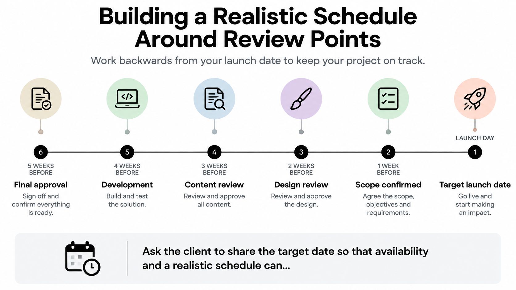
Start at the launch date and walk backwards. Clients share a target date so scope, availability and a realistic schedule can be discussed properly, and that conversation is far easier in week one than in month three when the date has become fixed and the scope hasn't.
Discovery and analytics review take one to two weeks on a mid-sized site. Journey mapping and wireframes follow, then usability testing with real customers before high-fidelity design, then build and quality assurance, then launch. Each sign-off gets a stated window: five working days for wireframe feedback, three for content, two for final approval. When feedback arrives late, the next phase moves and the launch date moves with it. Say that in the document, calmly, before it happens.
What late feedback actually costs
Every phase needs an owner, a duration and a review date, so the client can see precisely where a delay starts. Pair that with a short risk and assumptions register: content supply, third-party integrations, legal review of consent language, approval turnaround. Each entry gets an owner and the date it must be resolved by. A dependency that isn't on the page is a delay nobody planned for.
Baymard's research methodology describes moderated think-aloud testing across ecommerce sites, work that produced more than 34,000 usability issues distilled into 821 guidelines. That gives you a defensible basis for scheduling test rounds around concrete tasks, such as finding an item, comparing options and completing checkout, rather than asking users whether they like the interface.
This short walkthrough shows how review points and dependencies sit against a launch date.
Build quality assurance should include redirect mapping and search continuity checks, so existing URLs keep their traffic on day one, and event tracking parity, so the analytics you baseline against still fire after release. Launching without a rollback plan is the failure a schedule should rule out in writing, so put the trigger in the document: a defined drop in a protected metric, or a broken priority journey, restores the previous build within a stated window.
Treat those checks the same way as the wireframes. The rollback trigger, the tracking parity audit and the first post-launch measurement review are deliverables with dates, owners and pass conditions, which means the client can accept or reject each one before signing rather than discovering the gaps after launch. External research on checkout redesign produces headline conversion estimates that clients will already have seen. Those figures belong in an appendix as context, never in your target column, because presenting a research benchmark as a forecast turns it into a promise you'll be held to.
Presenting the Budget Line by Line
Cost follows scope, deliverables and the level of involvement required, so a credible figure can't exist before the scope does. When a client asks for a number in the first call, the honest answer is that the number depends on the page count, the test rounds and how much of the build sits with their team. Offer a discovery phase priced on its own, then the build priced against a defined scope.
Cost line | What drives the cost | How to show it |
|---|---|---|
Discovery and analytics audit | Number of templates, depth of analytics, access to data | Fixed fee with a stated output |
UX research and wireframes | Number of priority journeys and test rounds | Fee per journey or per test round |
Visual design and design system | Brand materials to integrate, number of components | Fee per template family and component set |
Accessibility testing and remediation | Number of templates, depth of manual checks | Testing as a fixed line, fixes priced by issue group |
Build support and QA | Platform such as Shopify, HubSpot or Wix, or custom build, plus integrations | Hours or fixed fee per release |
Post-launch review and optimisation | Length of monitoring, number of A/B tests | Optional line, priced separately |
The platform line matters more than clients expect. A Shopify theme, a HubSpot CMS build and a Wix site ask for different amounts of component work, different QA and different handover files. Naming the platform in the budget row stops the estimate drifting when the decision is finally made.
Contingency needs a release trigger
Add a contingency line of around 10% and say what it covers. An extra round of usability testing. One unplanned integration. Rework triggered by a brand refresh landing mid-project. Then state the trigger that releases it and who authorises the release. Contingency without a rule becomes the first line the client questions and the last one you can defend.
Tie payments to accepted deliverables, not calendar dates. Discovery signed off releases the next payment. Wireframes signed off releases the next. When a payment maps to an output, the conversation about money becomes a conversation about progress, which is a better conversation.
Payment rule: if a milestone can't be described as something the client receives and approves, it isn't a milestone. It's a date with an invoice attached.
Offer a phased quote with discovery priced separately, so a cautious client can stop after the audit without paying for a build they're not ready to commission. Show the total as the sum of the phase lines with assumptions listed beside it, so any scope change carries its price with it rather than arriving as a surprise later.
The rates themselves reflect a market where specialist digital skills are scarce. The government's digital and technologies skills assessment reports that roles requiring digital skills paid an average 29% premium, £37,000 against £28,700, and projects that 30 priority digital occupations will grow by 239,000 jobs, 27%, between 2025 and 2035. You're buying senior judgement, not production hours.
Confirm the Brief Before You Send the Proposal
Most bad proposals aren't badly written. They answer a question the client didn't ask, because nobody confirmed the brief first. A short brief is enough to start: the business, its goals, the design support needed, a budget range and the preferred launch timing. Five lines in an email will do it.
Client type changes the document. An agency wants a supplier who slots into an existing creative team and doesn't need managing. An in-house marketing team wants someone who can take a defined brief and return it on time. A brand going direct wants the whole argument, including the parts they hadn't considered. Steeve Elgui works with brands directly and with agencies, including inside established creative teams or on a single defined brief, and those two proposals never look the same.
Confirm the audience. Agency, in-house team or brand. The scope, tone and level of explanation all shift with the reader.
Test each of the five parts against its question, starting with the objective and its baseline metric.
Name the protected metric and the owner for every objective, so accountability is visible on the page.
Re-read the out-of-scope and deferred lists. If a reasonable client would be surprised by either, rewrite them.
Check the accessibility tests and the owner of the remediation backlog. A backlog with no name attached is a promise, not a plan.
Confirm the payment milestones and the contingency release rule. Money questions answered in the document don't resurface in the kick-off call.
Send the draft to everyone who must approve it and book the first review date before the proposal goes out, not after.
The test is simple. If the objective, the out-of-scope list and the first review date are unambiguous, send it. If any of the three still needs a phone call to explain, the proposal is doing the explaining badly.
Brand consistency is often where a brief is thinnest. Clients ask for a website and forget that the branding and brand integration work feeding it, the logo use, colour, typography and imagery, determines whether the new templates read as the same company as the email that lands the next morning. Ask what brand assets exist and who owns them before you price the design system, and ask it in writing.
Pricing is discussed once the scope, timing and budget indication are on the table. That order protects both sides: the client gets a figure that means something, and you avoid quoting against a scope that was never real.
If you're assembling a website redesign proposal and want the scope, accessibility tests and budget lines pressure-tested before it goes out, Steeve Elgui provides UX/UI design, design systems and brand integration for beauty, fashion, lifestyle, technology and ecommerce brands, plus CRM email and campaign work so the site and the emails after it stay consistent. Share a short brief with your goals, the support you need, your budget indication and preferred launch timing, and we can agree what's in, what's deferred and what gets measured. Start at Steeve Elgui.
Comments