Website Design Brief: How to Write One That Works
The most popular advice on briefs tells you to share mood boards, favourite sites and words like clean, bold and modern. That's precisely how a redesign stalls. A website design brief isn't a wish list of visual preferences. It's a decision tool. It decides what gets cut when time, budget and taste collide, and it states how you'll test whether the finished site works. If a designer can't say no to a request by pointing at your brief, the document hasn't done its job. Write the job first. Let the look follow.
Table of Contents
What a Complete Website Design Brief Contains - The Eight Components in Order
How to Set Goals and Measurable Success Criteria - Five Steps That Make Goals Usable - Rank Them or Lose Every Argument
Who the Site Serves and How Business Size Changes the Brief - Define Audience by Task and Knowledge
How to Scope Pages, Journeys and Navigation - Name the Critical Journeys
Deliverables, Acceptance Tests and Accessibility Requirements - Accessibility Needs Tests Not Adjectives
What a Complete Website Design Brief Contains
A brief that describes a look but not a job forces the designer to guess the commercial problem. Guessing is expensive. You pay for rounds of polished screens that solve nothing, then you argue about colour because there's no agreed test for success. Start with business context, goals and scope. Put colour, typography and imagery under deliverables, where they belong. Existing identity work still matters, and you can point to your branding guidelines and visual identity assets there, but they shouldn't open the document.
The Eight Components in Order
Component | Question it answers | Example entry | Often missed because |
|---|---|---|---|
Business context | What do you sell and why now? | Mid-sized fashion label, redesign after a slow spring launch | Teams assume everyone already knows |
Goals and success measures | What must change within 90 days? | Raise checkout completion from a measured baseline to a named target | Goals stay as adjectives such as modern |
Audience and user tasks | Who arrives and what must they do? | Returning customers finding size and delivery terms in three taps | Personas replace real tasks |
Scope and page list | What is in and out? | Homepage, three category templates, product page, checkout; blog out of scope | Scope creep starts with unnamed pages |
Deliverables | Which files and formats will you receive? | Sitemap, wireframes, responsive mockups, design system in Figma | Design is left undefined |
Technical constraints | What must the build work with? | Existing Shopify theme, current payment provider, no custom app budget | Developers find these late |
Timeline and approvals | When does it launch and who signs off? | Fixed launch window, two review rounds, one named approver | Approval chains are unclear |
Budget and ownership | What can be spent and who maintains it? | Budget band agreed, in-house team edits content after launch | Running costs are ignored |
Say a skincare brand needs one campaign landing page, not a relaunch. Its entry should still name the single action that must succeed, such as joining a launch list, the product count and who supplies copy. A consultancy replacing a brochure site needs the opposite emphasis, with enquiry quality, proof of expertise and an editable articles template.
Give a budget band, not one fixed figure. State whether it covers build, content production and post-launch edits, and name which items flex first if pricing comes in high. A brief is complete when a stranger could price, scope and test the project from it alone.
How to Set Goals and Measurable Success Criteria
"We want a modern site that drives engagement" can't guide a single design decision. It can't settle an argument between a bigger hero image and a faster product page. A usable goal names a metric, a baseline and a date, then ranks against your other goals. Ranking feels uncomfortable. That's the point.
The sequence below turns business frustration into briefable goals.
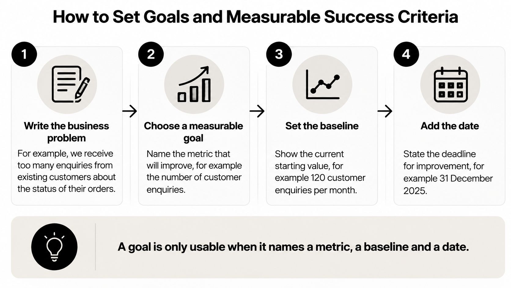
Five Steps That Make Goals Usable
Write the business problem in one sentence. "Enquiries from existing clients have fallen sharply since the last redesign" gives a designer something to investigate. Keep it to one problem per goal.
Turn each problem into one measurable goal. Pull the current baseline from analytics, your CRM or sales records. If you're running paid activity, align the measure with your campaign landing pages and conversion tracking so the site and ads aren't judged on different numbers.
Attach one primary user task to each goal. Booking a consultation, completing checkout on a phone or finding delivery terms before paying are tasks a designer can wireframe and test. A goal without a task floats.
Set review points at 30, 60 and 90 days. Name who reads each report and which dashboard they use. Launch day data proves little, because traffic mix and novelty distort behaviour.
Write down the decision each measure triggers. A missed target should lead to a content rewrite, a journey change, a technical fix or a brand adjustment. Decide the trigger now, not during a tense results meeting.
Rank Them or Lose Every Argument
Three unranked goals create three competing briefs. One stakeholder wants brand theatre on the homepage, another wants speed, a third wants every product above the fold. Without ranking, whoever speaks last wins.
A goal is only usable when it names a metric, a baseline and a date.
I would rank ruthlessly and write the order into the brief. When the homepage hero competes with load time, the ranked goal settles it in minutes. That tiebreaker is what your designer will rely on for the rest of the project, especially when feedback arrives as taste rather than evidence. Protect the first goal. Trade the third.
Who the Site Serves and How Business Size Changes the Brief
Business size changes what a brief must prioritise before any deliverable is listed. According to the UK Business Data Survey 2024, 68% of UK businesses had a website overall, ranging from 65% of sole traders to 99% of large businesses. A site is now standard infrastructure, but the team maintaining it differs enormously.
Business size | Businesses with a website (2024) | What the brief should prioritise |
|---|---|---|
All UK businesses | 68% | Clear goals, audience and budget set before deliverables |
Sole trader | 65% | Essential information, mobile usability, lead capture and an editable CMS |
Micro business | 74% | Simple information architecture, enquiry or booking routes and manageable updates |
Small business | 93% | Enquiry handling connected to CRM and stronger brand consistency across pages |
Medium business | 97% | Multiple user journeys, content ownership and defined approval stages |
Large business | 99% | Design-system governance, accessibility documentation and several internal stakeholders |
Define Audience by Task and Knowledge
List the three to five user groups who arrive. For each, write what they already know and what they need to decide. Demographics alone don't tell a designer whether to lead with price, proof or ingredients.
Say a skincare brand serves returning buyers hunting for ingredient and usage information, plus new visitors from paid social who need the product explained within one screen. Those two groups need different page openings, even on the same template.
You don't need a research department. Use lightweight evidence:
Customer interviews: Speak to a handful of recent buyers about what nearly stopped them.
Support emails and site search terms: These reveal labels customers use and information they can't find.
Top exit pages: Check where people leave before completing your primary task.
Personas that describe feelings but no tasks waste space. Before moving on, write down your audience list, your size band and your internal capabilities. Who edits pages, who approves, and who can fix a broken form?
How to Scope Pages, Journeys and Navigation
Scope is a list of pages, templates and journeys. It isn't "a full redesign" or "something ecommerce ready". The planning work below, including sitemaps and journey flows, is where scope becomes countable.
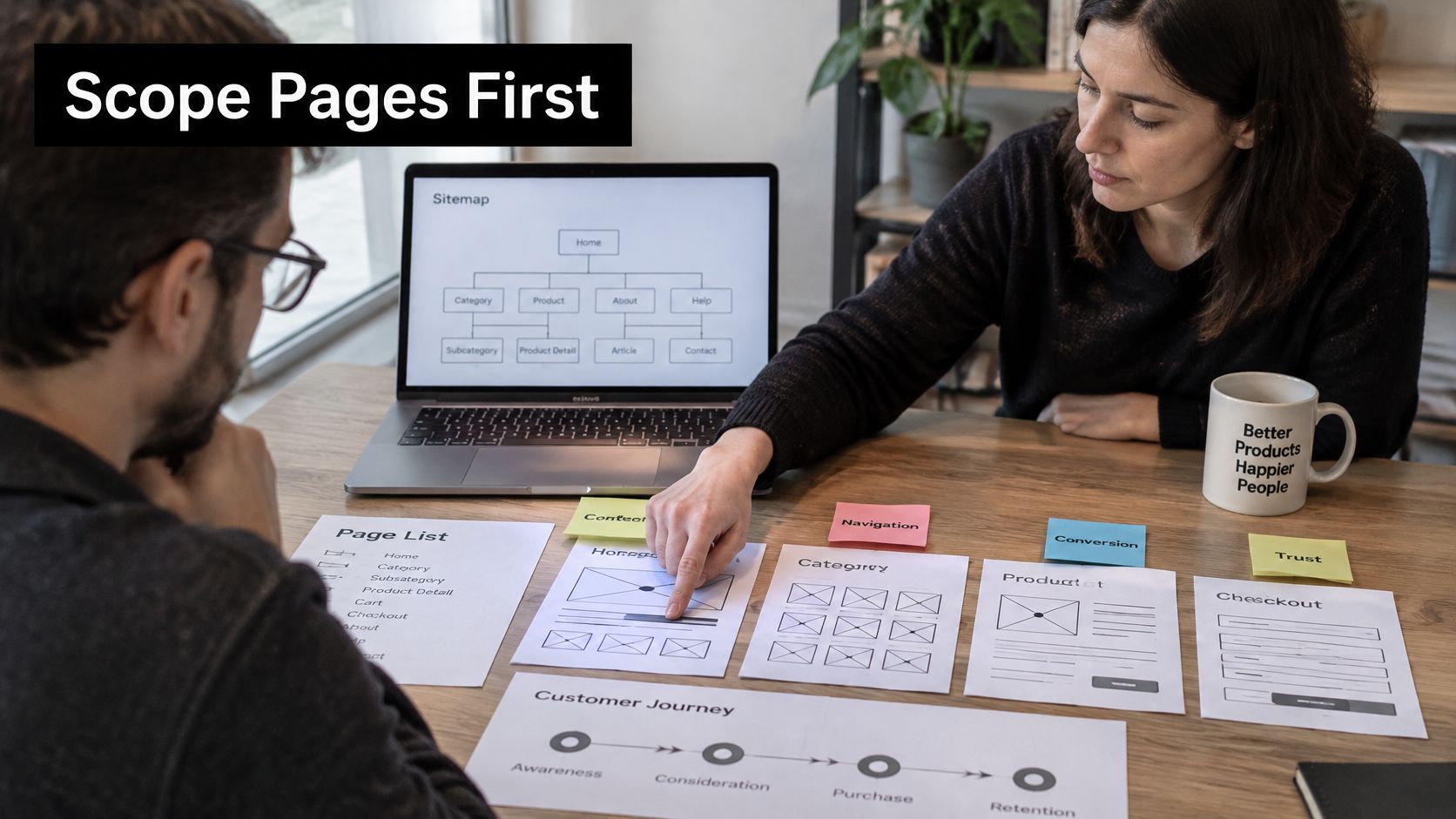
Start with a sitemap of every page in scope, then group pages into templates such as homepage, category, product, article and landing page. Templates represent the main design workload. Eighty product pages built from one template are one design problem, not eighty. This is the stage where structured UX and UI work on journeys and wireframes earns its cost, because dead ends are cheap to fix on paper.
Name the Critical Journeys
Pick the three to five journeys that must not fail and write them in plain language. Finding a product by size or shade, comparing delivery options, booking a fitting and completing checkout on a phone are testable. "Explore the brand" isn't.
A tight scope line for a London ecommerce brand reads like this. In scope are the homepage, three category templates, product page, cart, checkout and two campaign landing templates. Out of scope are the blog archive and account pages.
Findability needs its own requirement. In the central government websites annual report, 57% of users rated their overall experience as very satisfactory or satisfactory, yet only 51% rated how easy it was to find information as very good or good and just 42% gave the same rating to the website search tool. Satisfaction hides navigation failure. Test whether users locate key information without help, separately from whether they like the design.
The walkthrough below shows how journey thinking exposes unclear labels before visual design locks them in.
Finish with an explicit out-of-scope list. It prevents later debate. Add one rule and enforce it. Every page added after sign-off must replace an existing page or extend the budget and timeline.
Deliverables, Acceptance Tests and Accessibility Requirements
Deliverables without acceptance tests are just file names. Use this table as the contract for what finished means.
Deliverable | Format to request | Acceptance test |
|---|---|---|
Sitemap | Editable diagram or spreadsheet | Every in-scope page appears once, with an owner |
Wireframes | Figma frames annotated for behaviour | Each critical journey completes on a phone without help |
Responsive mockups | Figma frames at mobile, tablet and desktop widths | Key templates checked at each width before visual polish |
Design system | Figma library with colour and type tokens | Components reused across at least three templates |
Accessibility specification | WCAG 2.2 AA notes on each template | Keyboard-only and screen-reader checks pass on checkout |
Performance budget | Page-weight and Core Web Vitals targets per template | Field data at the 75th percentile meets the agreed limits |
Content templates | Editable blocks in the CMS | An editor publishes a new page without developer help |
Handover pack | Exported assets and usage guidelines | A developer builds a template without a follow-up call |
Accessibility Needs Tests Not Adjectives
"Accessible" means nothing until someone tabs through checkout and finds visible focus states, labelled form fields and no keyboard traps. The scale of failure is well documented. UK government monitoring published in the accessibility monitoring of public sector websites and mobile apps 2020 to 2021 report identified 2,691 issues across a sample of 421 tests, and after a typical 12-week remediation period, only 59% of website owners had fixed the identified issues or established short-term timelines. Late discovery creates that backlog.
Specify WCAG 2.2 AA as the target. Name the templates tested first, starting with product discovery, filters, size or shade selection and checkout. Require an issue log with severity, owner and retest status for every critical journey.
Don't confuse tools with testing:
Automated scans: They catch some contrast, markup and missing-label errors quickly.
Manual keyboard checks: They reveal focus order, traps and whether controls work without a mouse.
Screen-reader checks: They judge whether headings, link text and error messages make sense in sequence.
An accessibility statement or a clean scan doesn't prove usability. Evidence per journey does.
Scheduling rule: Project timing depends on the size and complexity of the brief, the materials available and the review process, so attach approval rounds and named content owners to dates.
Performance belongs in the same table. Set targets per template, not one vague promise for the whole site. Following the thresholds set out in Fasterize's UK web performance ranking guidance, require Largest Contentful Paint of 2.5 seconds or less at the 75th percentile, and state the device and connection used for acceptance testing. Visual impact gets judged alongside speed, never instead of it.
Check Your Brief Before You Send It
Three mistakes cause most rework. Teams write the brief after choosing a visual direction, leave content owners unnamed, and treat the document as final instead of revising it after discovery. Each one surfaces late, when change costs money.
A two-page brief sent early beats a polished twelve-page one sent late. To start a project, a short brief is enough, covering the business, goals, design support needed, budget and preferred timing. Share your target launch date too, so scope, availability and a realistic schedule can be discussed properly.
Run a final pass and confirm every field has a real value, including baselines, page list, accessibility owner, budget band and launch window. Then send it to one or two designers and ask how they'd change scope to fit your budget. Their answers expose whether scope and money agree. Clients can start by booking a discovery call to test exactly that fit.
A brief is ready when a designer can say no to something clearly.
If your brief names the job but the pages, journeys and tests still feel tangled, that's the moment to get a senior designer involved. We work with beauty, fashion and ecommerce teams in London on website experiences, branding and campaigns, turning short briefs into scoped, testable design work. Send yours over and start the conversation at Steeve Elgui.
Comments