10 Website Design Principles That Make Sites Work
A beautiful website can still send customers away. The 2019 Click Away Pound report, discussed by the UK Parliament's Women and Equalities Committee, found that 69% of disabled internet users with access requirements had clicked away from websites because of accessibility barriers. Looking polished isn't the same as working well.
The websites that feel right rarely depend on taste alone. Designers make disciplined decisions about what visitors should notice, how information fits together, what an action looks like and what happens when someone uses a phone, keyboard or slower connection.
Those decisions matter beyond the homepage. A customer might discover a skincare collection through an email, compare products on mobile and return through a campaign advert. If each touchpoint uses different language, priorities or interaction patterns, the customer has to keep working out how the experience works.
Website design principles are a practical toolkit, not a visual style. They help you turn a crowded page into a clear path without stripping away the information or personality that makes a brand worth choosing.
The useful question isn't whether a design looks minimal, premium or modern. It's whether people understand it, can use it and feel confident taking the next step. These principles turn that question into decisions you can implement and test.
Table of Contents
2. Simplicity and Minimalism - Simplify the task, not just the layout
3. Consistency Across Touchpoints - Share rules, not identical layouts
4. Mobile-First and Responsive Design - Design around interruptions
5. Intuitive Navigation and Information Architecture - Organise before styling
6. Accessibility by Design - Test the task from beginning to end
7. Performance and Fast Loading - Set priorities before adding assets
9. Clear Affordance and Interactive Feedback - Specify behaviour alongside appearance
10. Emotional Design and Brand Personality - Turn personality into decisions
Put These Principles to Work - Move from observation to a tested decision
1. Visual Hierarchy
When a promotion badge, product photograph, delivery message and purchase button all demand attention, the customer has to decide what matters. Visual hierarchy makes that priority clear through size, weight, contrast, spacing and placement.
For a fashion product page, let the photography establish the product, keep the name and price easy to locate, and give the purchase action a distinct treatment. Supporting information should remain available without competing at the same volume.

Decide what deserves attention
Build heading, body and button styles into Figma components rather than adjusting each page independently. Apply the same priority to campaign emails: the offer, supporting reason and action should remain recognisable even when the layout changes.
Make the main action distinct. Reserve your strongest button treatment for the action that advances the current task.
Keep supporting choices quieter. Size guides and delivery details need visibility, not the same emphasis as adding to basket.
Test without detail. Blur a screenshot or squint at it, then check whether the intended focal point still stands out.
The failure mode is making everything bigger whenever a stakeholder asks for prominence. Instead, ask what should become less prominent. Test the result by showing the page briefly to someone unfamiliar with it and asking what they noticed and what they'd do next.
2. Simplicity and Minimalism
Simplicity means removing unnecessary work, not necessary information. A skincare page can look beautifully restrained and still fail if customers can't find ingredients, suitability or application advice.
Keep the interface quiet while making the product story specific. Strong photography, plain language and well-grouped details usually serve this better than decorative panels or repeated promotional messages.

Remove what distracts from a decision. Keep what helps someone make it.
Say you're designing a moisturiser launch page. Lead with what the product is and who it's for, then organise benefits, ingredients and usage into clearly labelled sections. Don't hide every useful detail inside an accordion just to preserve an empty-looking screen.
Simplify the task, not just the layout
Audit each element against a practical question: does it help the visitor understand, decide or act? A decorative graphic that looks clickable but does nothing is a good removal candidate; a detailed ingredient list isn't.
Use Hotjar heatmaps to identify unexpected clicks, then investigate with usability sessions rather than treating a heatmap as an explanation. Ask customers to choose a suitable product and explain their decision. If they need information you've removed, the design is sparse, not simple.
3. Consistency Across Touchpoints
A customer clicks a cream-coloured email promoting a new collection and lands on a brightly coloured page with a different headline and unfamiliar photography. Even if both designs are attractive, the transition makes them check whether they're in the right place.
Consistency preserves recognition across channels. The Office for National Statistics reported that online spending accounted for 50.5% of total UK card spending in September 2025, giving teams a commercial reason to treat connected digital journeys seriously.
Share rules, not identical layouts
Start with a Figma library containing colour styles, typography, spacing, buttons and image treatments. A documented brand identity design approach should explain how those choices extend into websites, CRM emails and campaign assets.
Preserve the promise. Carry the campaign's product, offer and wording onto the destination page.
Adapt to the channel. Translate website styles into reliable Klaviyo, Mailchimp or HubSpot templates rather than forcing identical rendering.
Review the whole journey. Place the advert, email and landing page beside each other before approval.
Consistency goes wrong when teams confuse it with repetition. A campaign can introduce fresh art direction without replacing familiar navigation or button behaviour. Test by asking someone to move from email to landing page and explain whether the destination matches what they expected.
4. Mobile-First and Responsive Design
Start with the screen where space is hardest to negotiate. The 2025 UK Global Digital Shopping Index reported that 66% of consumers used a mobile device for their latest online purchase.
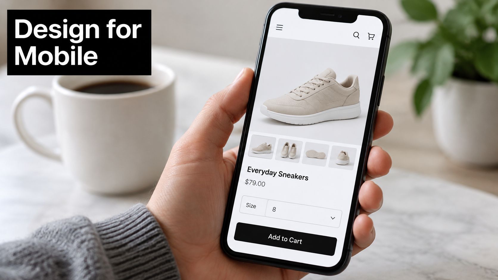
Mobile-first design means deciding what matters before adding desktop space. It doesn't mean squeezing the desktop composition into a narrower frame.
Design around interruptions
For a sneaker product page, keep the image, size selection, availability and purchase action easy to reach. Then check what happens when a consent banner, promotion bar and mobile keyboard appear.
UK smartphone research published by Accessiway found that 21.5% of smartphone users encountered difficult-to-close adverts, pop-ups and cookie prompts. A responsive grid doesn't solve an overlay that blocks the task.
Use comfortable touch targets. Give controls generous clickable areas and enough separation to avoid accidental taps.
Test enlarged text. Check that labels, prices and buttons remain readable without overlap.
Check connected emails. Review stacked layouts, image cropping and dark mode on actual phones.
The common failure is approving mobile from a static Figma frame. Test the coded journey on a device, including consent, navigation, form entry and checkout. Sticky controls are useful only when they don't obscure content or compete with other fixed elements.
5. Intuitive Navigation and Information Architecture
A beauty shopper may know their concern but not your product names. Navigation organised only around internal ranges makes that customer translate their needs into your catalogue.
Information architecture should reflect how customers look for things. Offer meaningful routes such as product type, routine or concern, while keeping labels plain enough to understand without brand knowledge.
Organise before styling
Map the journey in Miro before designing a menu. A customer seeking a cleanser for sensitive skin should be able to move from a relevant category to useful filters, product details and suitability information without repeatedly starting again.
Test category groupings. Use card sorting to understand where customers expect products and support information to sit.
Show location. Add meaningful page titles, selected filter states and breadcrumbs where they help.
Support recovery. Give empty search results spelling guidance, related categories or a clear way to remove filters.
A freelance UX designer can help separate structural problems from visual ones. A larger menu won't fix categories that overlap or labels customers don't understand.
Test navigation with realistic tasks rather than asking whether people like the menu. Ask someone to find a suitable cleanser, locate delivery information and return to their filtered results. Watch for backtracking and unexpected search terms, then adjust the structure before polishing its appearance.
6. Accessibility by Design
Accessibility belongs in the component specification, not the launch checklist. Designers need to define how people perceive content, operate controls, understand instructions and recover from mistakes.
The Government Digital Service's accessibility monitoring report identified 29,787 accessibility issues across its monitored public-sector services. Recurring problems included insufficient contrast, missing visible keyboard focus, keyboard-operation failures and inadequate content reflow.
Test the task from beginning to end
Consider checkout. A customer needs persistent field labels, understandable validation and a way to move through every control without a mouse. An error message should identify the problem and explain how to correct it without deleting valid entries.
Define accessible colours early. Check text, borders and interactive states against their actual backgrounds.
Specify focus behaviour. Include visible focus styles and a logical keyboard order in component documentation.
Use meaningful structure. Write descriptive links, semantic headings and image alternatives that communicate purpose.
Practical rule: An accessible homepage doesn't compensate for a checkout someone can't complete.
Use WCAG-based acceptance criteria, keyboard testing and screen-reader workflows alongside visual review. Include people with access needs when testing important journeys.
The failure mode is treating an automated scan or accessibility statement as proof of usability. Both can support the process, but neither replaces checking whether someone can search, compare, buy and obtain support.
7. Performance and Fast Loading
A full-screen campaign video may establish mood, but it shouldn't stop someone from reading the product name or using navigation. Performance is partly a design decision: imagery, fonts, motion and third-party features all carry implementation costs.
For an image-led fashion launch, agree which visual assets are essential before development. Keep the hero useful while it loads, and reserve its space so the layout doesn't jump when the image appears.
Set priorities before adding assets
Prepare images for their placement. Supply responsive sizes and appropriate compression instead of sending oversized originals everywhere.
Keep font loading deliberate. Include the families and weights the design uses, with suitable fallbacks.
Question every script. Remove redundant widgets and marketing tags with the people responsible for them.
Measure real behaviour. Use Google's PageSpeed Insights to investigate Core Web Vitals and loading problems.
Don't lazy-load the main image that visitors need immediately. Defer off-screen galleries and secondary embeds instead, and keep email layouts lightweight without turning essential copy into images.
The failure mode is chasing a performance score while ignoring the task. Test on a phone with a constrained connection and check when the page becomes readable and usable. During a redesign, include these decisions in the website redesign checklist so visual approval doesn't happen separately from technical feasibility.
8. Whitespace and Breathing Room
Look at a product card where the price sits closer to the next item than to its own name. The problem isn't a lack of decoration; it's an unclear relationship.
Whitespace groups information as well as separating it. Keep related details close and leave a more noticeable gap between unrelated sections.

Make spacing systematic
Define spacing tokens in Figma for component padding, related content and section breaks. Use them across product pages, campaign landing pages and email modules so the rhythm remains deliberate.
For a skincare page, keep each ingredient explanation close to its heading, then separate that group from application instructions. Limit text width so readers don't have to track long lines across a desktop display.
Generous space works when it clarifies relationships. Empty space without purpose is just distance.
Whitespace goes wrong when a premium aesthetic becomes an excuse for excessive scrolling or tiny type. A large desktop margin may need to shrink substantially on mobile, while comfortable internal padding should remain.
Test with realistic content, including long product names, translated copy where relevant and enlarged text. Temporarily remove decorative borders and background panels: if the grouping becomes confusing, revisit proximity rather than adding another box around everything.
9. Clear Affordance and Interactive Feedback
A customer taps Add to basket and nothing visibly changes. They tap again, then open the basket to check whether anything happened.
Affordance signals what someone can do; feedback confirms the result. Buttons should look actionable, links should be recognisable, and form fields should clearly invite input.
Specify behaviour alongside appearance
In Figma, document hover, focus, pressed, loading, disabled, success and error states. Explain transitions and recovery behaviour during handoff, not just the finished appearance.
Confirm the action. Show an updated basket and a clear acknowledgement after a successful addition.
Make errors useful. Explain that a postcode needs checking rather than displaying a vague invalid-input message.
Preserve progress. Keep valid form entries when another field needs correction.
Respect motion preferences. Make feedback understandable without depending on animation.
A subtle colour change isn't enough if someone can't perceive it. Pair visual changes with meaningful text and appropriate programmatic status messages.
The failure mode is polishing hover effects while leaving loading and failure states undefined. Test a slow response, an unavailable product and a rejected form submission, then observe whether users understand what happened and what to do next.
Use this video as an additional prompt for reviewing interaction design.
10. Emotional Design and Brand Personality
A beauty brand can feel clinical, expressive, reassuring or experimental without changing the basic mechanics of shopping. Photography, typography, colour and language establish that character.
Brand personality should enrich familiar interactions, not replace them. Keep navigation understandable and purchase actions recognisable while giving editorial areas room for distinctive art direction.
Turn personality into decisions
For a precise, science-led skincare brand, use controlled image crops, clear ingredient explanations and restrained motion. For an expressive cosmetics launch, explore bolder compositions and playful copy, but keep shade selection and product information straightforward.
Define the intended character. Choose a small set of adjectives, then describe what each means for imagery, type and voice.
Explore before producing. Use Midjourney or Firefly for concept development, then refine through deliberate art direction and accurate product representation.
Carry the tone across channels. Connect landing-page imagery with email headers and campaign assets without repeating every layout.
The failure mode is confusing novelty with personality. An unfamiliar cursor, cryptic menu or elaborate page transition can make a brand distinctive for the wrong reason.
Test emotional tone without leading the participant. Ask customers how they'd describe the brand, what they expect from its products and whether the experience supports those expectations. Then ask them to complete a task: the right feeling still needs a usable foundation.
The 10 website design principles at a glance
Principle | Core Question It Answers | Key Practice | Common Pitfall | Especially Valuable For |
|---|---|---|---|---|
Visual Hierarchy | What should visitors notice first? | Use size, contrast, spacing, and placement to prioritize content and actions. | Emphasizing too many elements at once. | Ecommerce pages and campaign messages with clear conversion goals. |
Simplicity and Minimalism | What can be removed without making the experience less useful? | Keep a focused palette, limited typefaces, and purposeful content. | Removing information customers need. | Premium brands seeking clarity, trust, and a focused product experience. |
Consistency Across Touchpoints | Does the brand feel connected across channels? | Reuse shared design rules, components, and tone of voice. | Making campaigns feel repetitive through overly strict consistency. | Brands coordinating websites, email, campaigns, and print. |
Mobile-First and Responsive Design | Does the experience work well on every screen size? | Start with mobile, then adapt layouts for larger screens. | Shrinking desktop layouts instead of designing for mobile needs. | Ecommerce and email experiences used heavily on phones. |
Intuitive Navigation and Information Architecture | Can visitors find what they need and understand where they are? | Use clear labels, logical groupings, search, and filters. | Hiding content in deep structures or using confusing labels. | Sites with large product catalogues or varied support content. |
Accessibility by Design | Can people with different abilities perceive and use the experience? | Provide sufficient contrast, keyboard access, descriptive labels, and clear forms. | Relying only on automated checks or leaving accessibility until late. | Any website, especially those seeking broad reach and lower compliance risk. |
Performance and Fast Loading | Does the site become usable quickly and reliably? | Optimize images, limit scripts, and measure Core Web Vitals. | Letting heavy media and third-party tools slow the experience. | Image-led ecommerce sites and visitors on slower mobile connections. |
Whitespace and Breathing Room | Does the layout give content enough space to be clear and focused? | Apply a consistent spacing scale and separate related content thoughtfully. | Using so much space that important content is pushed out of view. | Premium brand layouts and pages that need stronger readability or focus. |
Clear Affordance and Interactive Feedback | Can users tell what they can do and whether an action worked? | Make controls distinct and provide clear states, confirmations, and errors. | Weak action cues or distracting, excessive animation. | Checkout, booking, and sign-up flows. |
Emotional Design and Brand Personality | What should visitors feel about the brand? | Align imagery, typography, colour, and motion with brand personality. | Letting style override usability or relying on short-lived trends. | Brands seeking a memorable identity and emotional customer connection. |
Put These Principles to Work
Start with a screen that matters commercially, such as a campaign landing page, product detail page or checkout step. Choose a principle and identify a specific obstacle rather than declaring that the whole website needs to feel more premium.
A useful diagnosis describes behaviour. The offer is difficult to find, the selected filter isn't obvious, or the consent banner covers the purchase button. Those observations give designers and developers something concrete to change and test.
Move from observation to a tested decision
Record the current experience before editing it. Capture the screen, note the expected action and describe what might prevent someone from completing it.
Make a focused change. Adjust hierarchy, wording, grouping or interaction behaviour without changing everything at once.
Test realistic conditions. Include mobile devices, enlarged text, keyboard navigation and imperfect loading.
Review the connected journey. Check whether the email or advert still matches the destination.
Document what works. Update the component or guideline so other pages benefit from the decision.
Prioritise blockers before cosmetic refinements. A beautiful image treatment can wait if customers can't select a size, understand an error or dismiss an overlay. Equally, don't reduce every design discussion to friction removal: product understanding and brand character deserve deliberate attention too.
These are the disciplines senior freelance designer Steeve Elgui brings to brand work, including UX/UI with wireframes, journey mapping and design systems, grounded in 12 years of experience across beauty, fashion, lifestyle, technology and ecommerce. The important connection is between structural decisions and visual expression, rather than treating them as separate stages with unrelated priorities.
Apply the same thinking to your existing materials before commissioning more. A campaign may need a clearer destination page rather than another visual concept; an email template may need better hierarchy rather than a new identity. Diagnose the problem at the point where the customer encounters it.
Good website design principles aren't guarantees of higher sales, and they shouldn't become rigid aesthetic rules. Use them to make a clear hypothesis, test it with people and carry successful decisions into the wider system. A consistent approach across website, email and campaign touchpoints is what turns sound individual decisions into a coherent customer experience.
Steeve Elgui offers UX/UI, branding, CRM email design and digital campaign services to help connect clear website journeys with consistent brand expression. Visit Steeve Elgui with a short brief covering your business, goals, design support needed, budget and preferred timing to discuss a focused improvement or broader design project.
Comments